Creating charts
This topic describes how to add a new Chart Object to a Screen or a Container and its specific properties.
To create a new Chart, you need to access a Screen in Design mode.
Once you're in the Screen editing page, locate the desired Chart from the Screen Objects list in the left panel, then drag and drop it onto your Screen or Container.
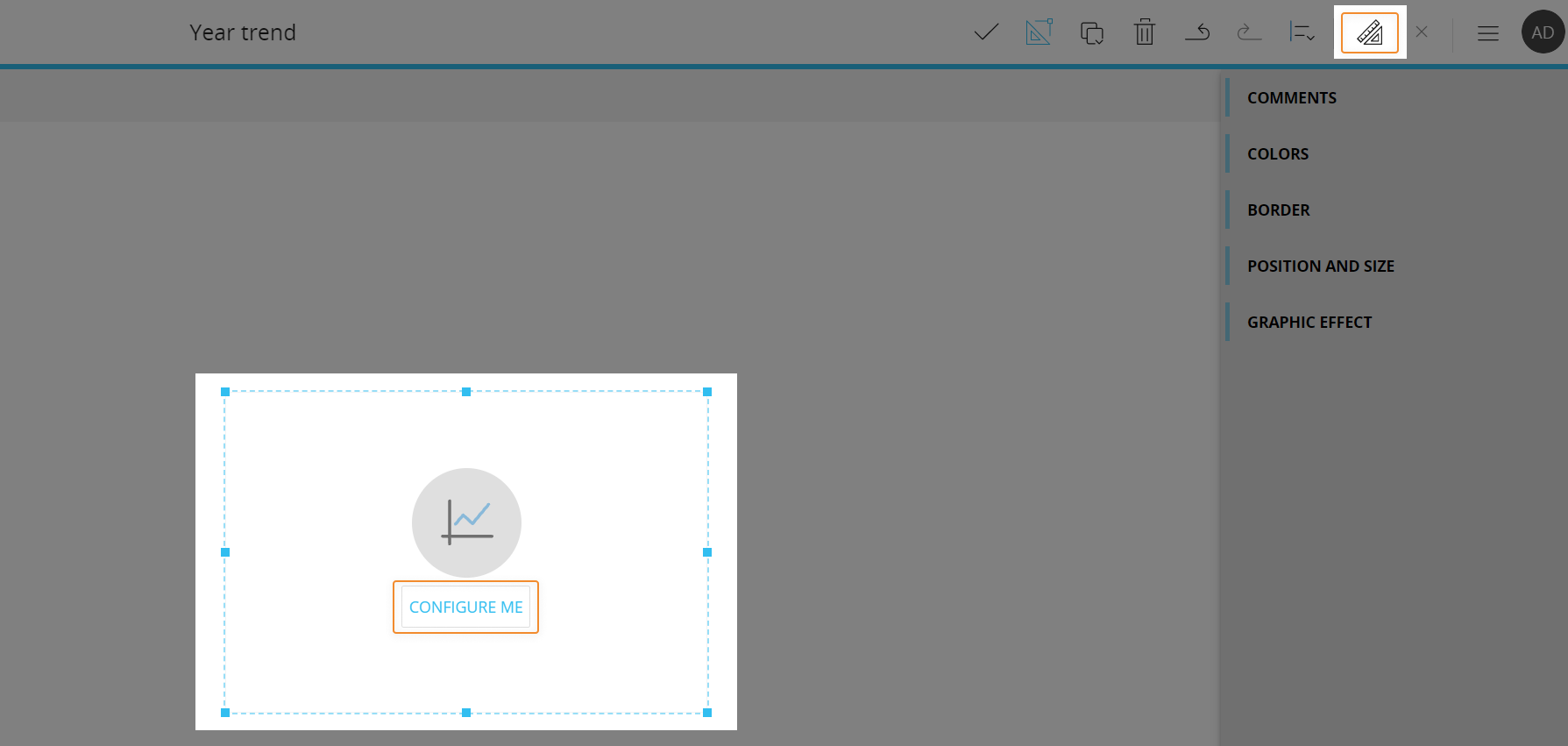
When you create a Chart, it is initially empty. The next step is to configure a Layout that will define the data to be displayed in the Chart. To do so, click the "Configure me" button or select the Chart Object and click the "Configure layout" button ( ) located in the Top Menu of the Capsules workspace.
See The Layout Object, Configure a Layout and About data blocks of a Layout for more details on the Layout Object.
The Chart, just like every other Object, can be moved, resized, duplicated via copy/paste and easily aligned with other Objects on the Screen.
See Configure Screen Objects for more details.
Jump to:
Chart Layout
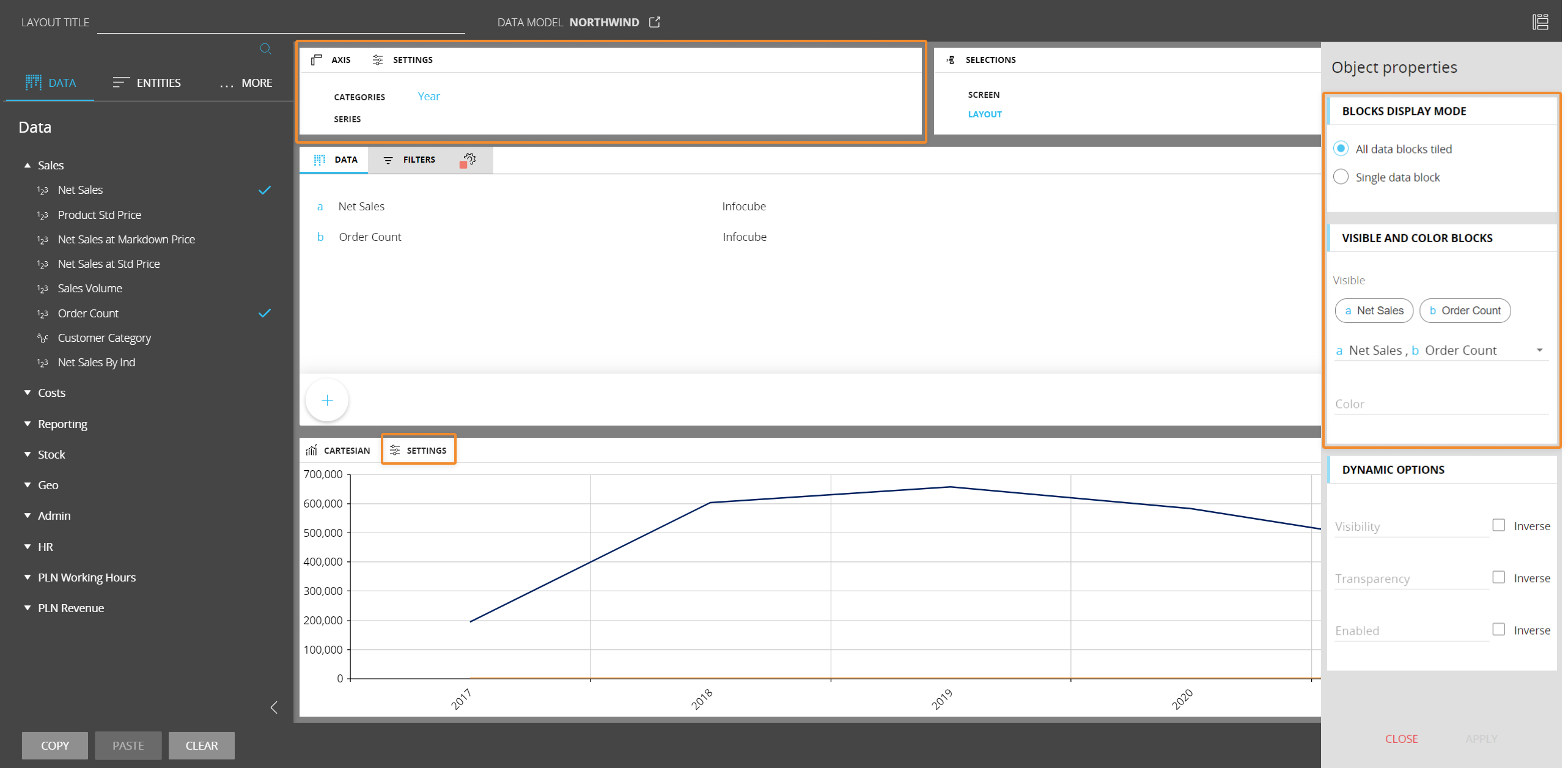
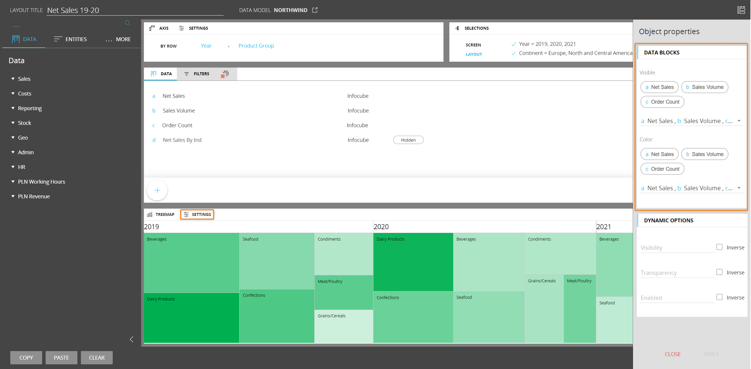
The Layout editor for Charts Objects is slightly different from the classic one, in that it offers some chart-specific options and properties.
The main differences are highlighted in the image below:
The Axis area
Depending on the chart type, in the Axis area you can define categories, series, rows, columns, points and other dimensions.
If you add two or more Entities in the "Categories" field, Board will group them according to the following criteria:
- If Entities are related (i.e. they are part of the same hierarchy), the most nested Entity in a Relationship is always arranged in the rightmost position and you won't be able to rearrange their order. The least nested Entity will appear on top of the chart (Entity Grouping), while the most nested Entity will be shown in the primary X axis
- If Entities are not related, you can freely rearrange their order in the field: to do so, drag and drop them in the desired position. The least nested Entity will appear on top of the chart (Entity Grouping), while the most nested Entity will be shown in the primary X axis
The Chart Object doesn't support multiple Entities in the "Series" field.
Entity grouping is supported only on Cartesian and Waterfall charts. In all other cases, only the most nested Entity (i.e. the one in the rightmost position in the "Categories" field) will be shown in the primary X axis. See Charts properties and settings for a full description of options specific to each chart type.
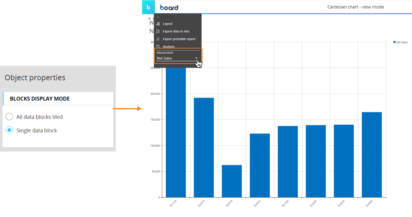
Object properties
In the Layout editor, under the Object properties panel, the "Block display mode" menu lets you choose between two display modes for Blocks in the Layout:
- All data blocks tiled. One block viewable at a time: enable this option to view each Block in the Layout
- Single data block. Multiple Blocks stacked, clustered or as different types: enable this option to view all Blocks at once on a single Chart Object. You can select which Block you want to display from the sliding toolbar in Play mode
The "Visible and Color Block" menu lets you show/hide Blocks in the chart and configure a color alert that will be shown in the chart background.
To hide a Block, open the dropdown list and deselect the Block you want to hide.
Blocks hidden using the dedicated option in the Block settings panel won't be available in the dropdown list.
The "Block display mode" and "Visible and Color Block" menus are not available for all chart types. See Charts properties and settings for a full description of options specific to each chart type.
To configure a color alert for the chart background, click on the "Color" field and select a Block from those suggested.
The color alert will be driven by the values of the selected Block and the chart background color will change accordingly.
Blocks hidden using the dedicated option in the Block settings panel won't be available in the dropdown list.
The color alert will be set using default settings. However, you can change those settings from the color alert menu in the Block settings panel.
Charts properties and settings
Chart properties are available from the contextual right panel of the Screen editing page once the Chart Object is selected and it's associated with a Layout.
Each chart type has its own specific settings and configuration options. However, all charts share options common to all Screen Objects and the following two properties:
- Master object. If enabled, clicking on a series, a category or a marker (if available) will update the data displayed by all other Objects on the Screen in order to show only the data relating to the clicked item. The Master object result is similar to applying a Screen Selection
- Disable Drill down. Disables the drill-down functionality on the selected Chart Object, both in Design and Play mode. (Not available for the Bullet chart)
Cartesian
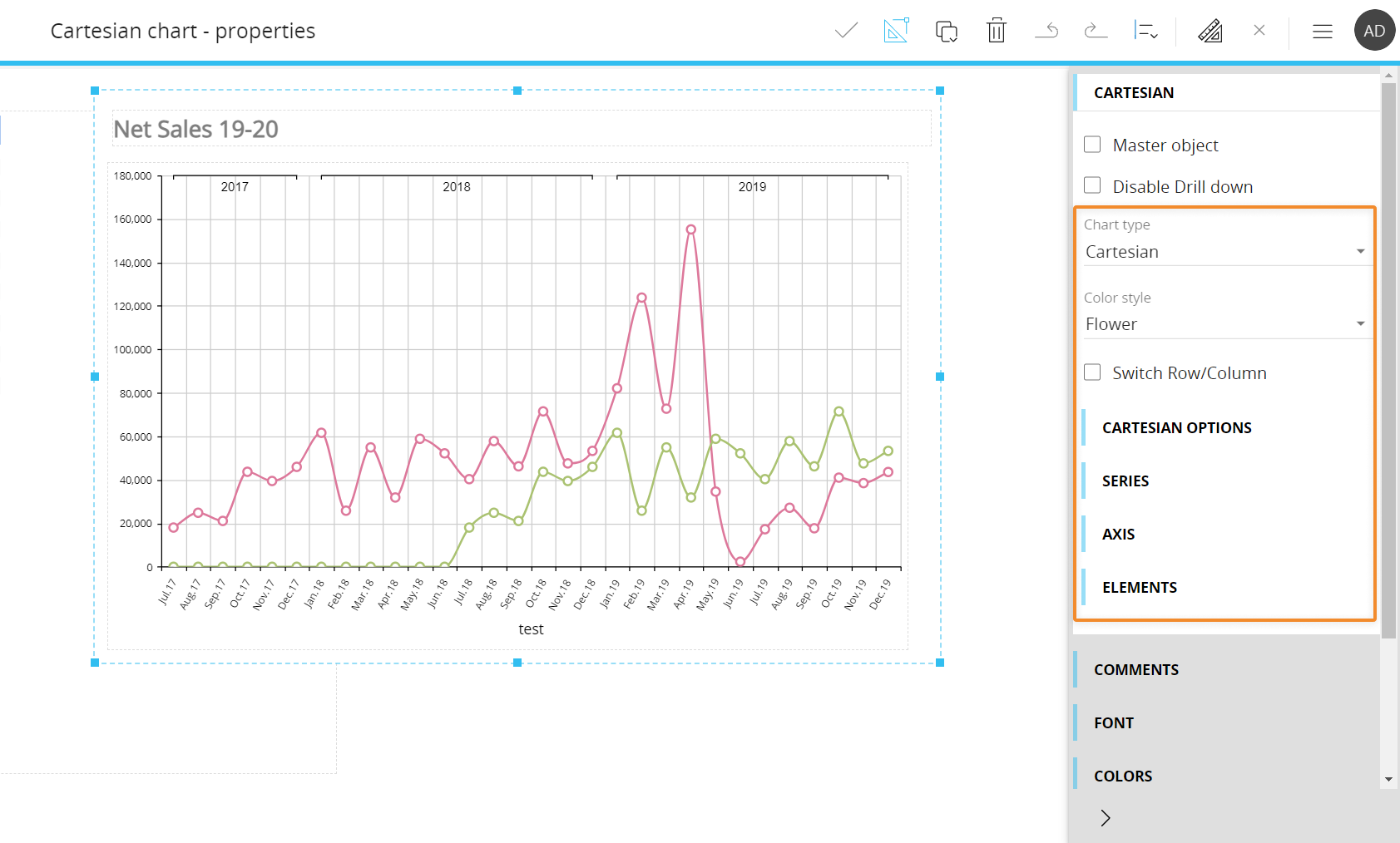
The following properties are available for the Cartesian chart:
- Chart type. Using this menu, you can easily switch to Cartesian, Pie, Radar and Waterfall chart types without the need to create new Screen Objects
- Color style. Applies a pre-configured color style to series
- Switch Row/Column. If enabled, Blocks will be displayed in the X axis and Entities set in the "Categories" field of the Layout will be displayed as series. The option does not change the associated Layout
Under the Cartesian options menu, the following options are available:
- Switch orientation. Switches the chart orientation. When changing the orientation, the numerical axis and the row axis are switched.
- Enable trackball. Enables the visualization of a Label containing data of all Blocks set in the Layout when you hover over different areas of the chart. (Not available for the Waterfall series type)
- Crosshair. Crosshairs are thin vertical and horizontal lines centered on a data point in a chart. Choose between vertical, horizontal or both to allow your users to be able to target a single element in the chart using the line and see the value of the selected data point
- Drag. Lets you configure the default action when a user drags the mouse over the chart. The available options are:
- Pan. Select this option to allow users to navigate through a zoomed chart by dragging the mouse
- Zoom. Select this option to allow users to zoom in the chart by dragging the mouse. Zooming is also possible using the mouse wheel.
- Select (default). Select this option to allow users to select a set of categories in the chart by dragging the mouse. When the mouse button is released, the selection is applied as a Screen selection and all other Objects on the Screen are updated accordingly
- Zoom and pan. Lets you configure the default zoom direction when zooming using the mouse wheel, vertical, horizontal or both
Under the Series menu, the following options are available:
- Select series. Select series to edit settings for. Select "All" to edit all series at once
- Series type. Select chart type to use for selected series (line, area, point, bar, funnel etc.)
- Combine mode. Choose how to display the associated Layout definition containing more than one Block. The available options are:
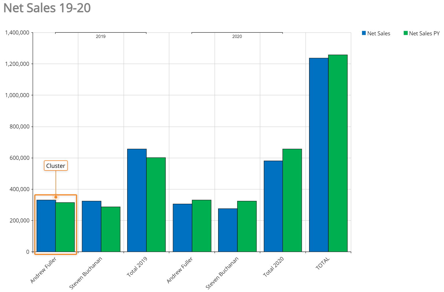
- Cluster (only available for Bar series types). Combines Bar series in clusters for every element in the category axis
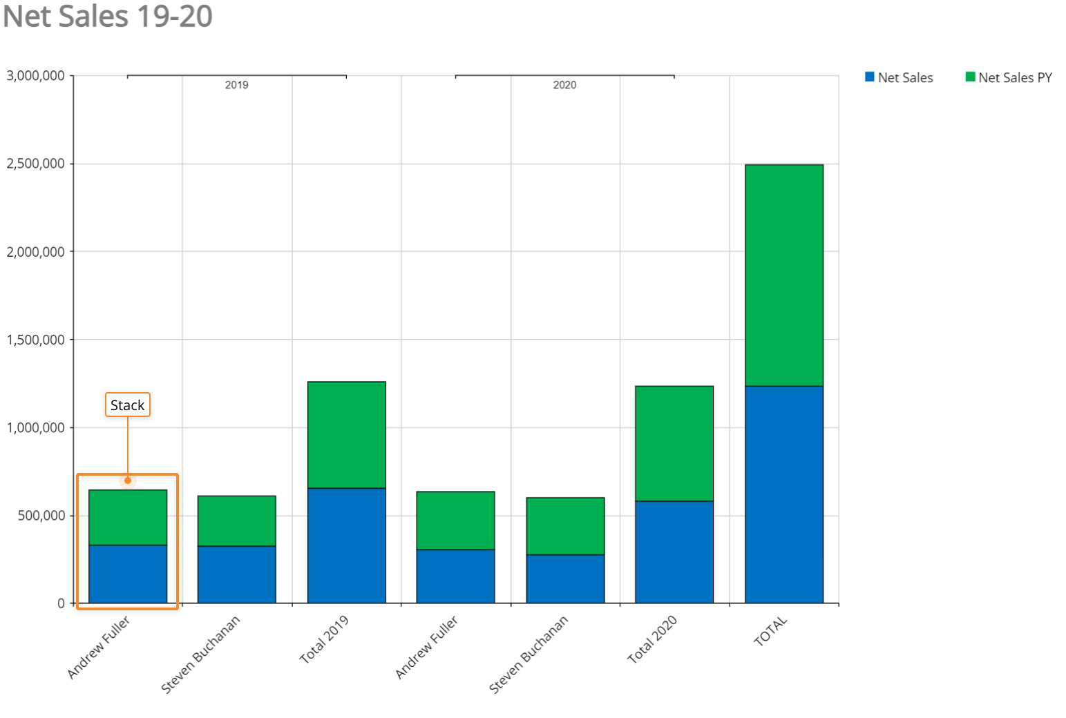
- Stack. Each bar displays a total amount, broken down into sub-amounts. Equivalent subsections are the same color in each bar
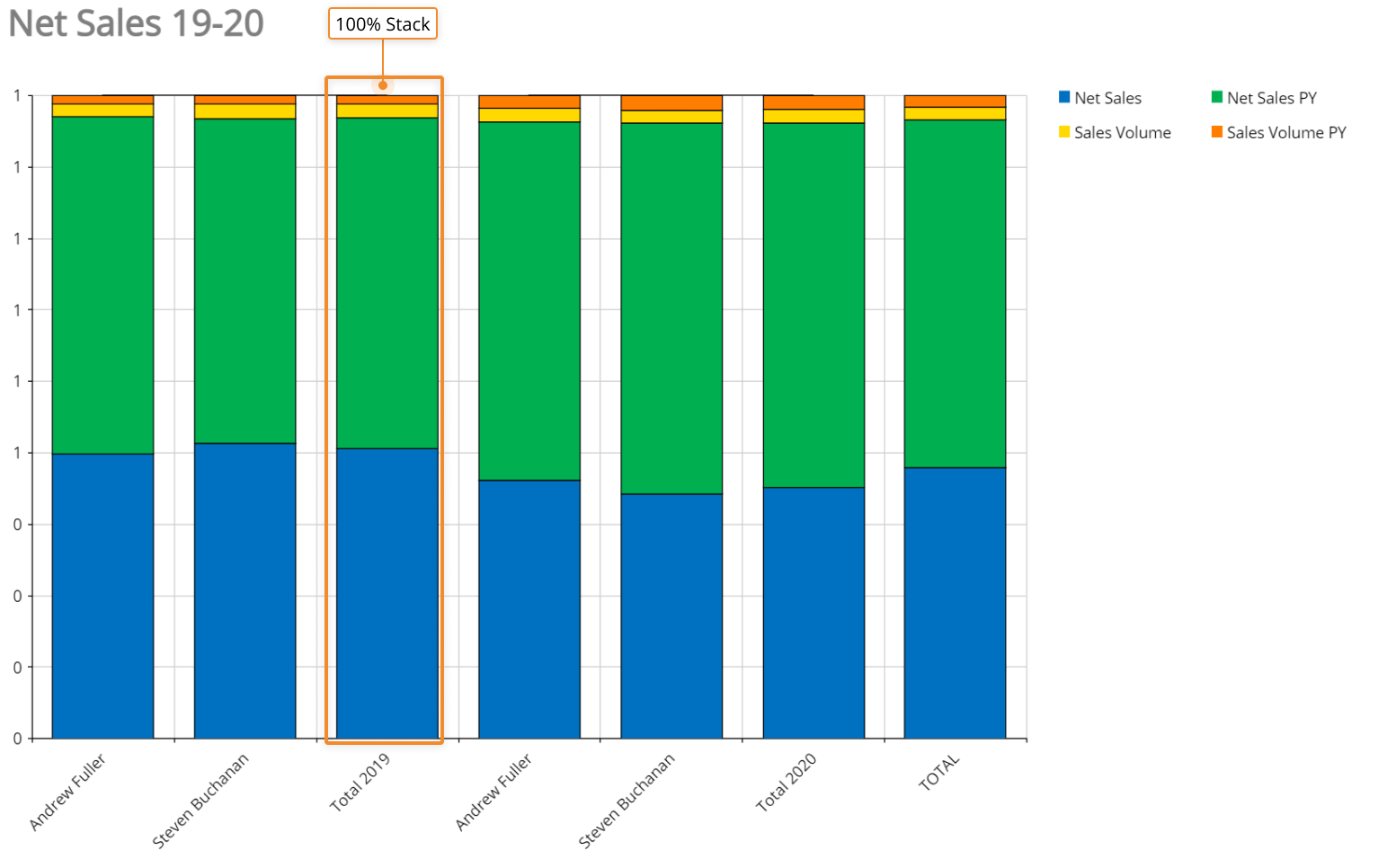
- Stack 100. Each bar is the same height or length, and the sections are shown as percentages of the bar rather than as absolute values
- Cluster (only available for Bar series types). Combines Bar series in clusters for every element in the category axis
- Line width. Defines the line width for line-based series types
- Hide zeroes. When enabled, series that have zero value won't be plotted in the chart
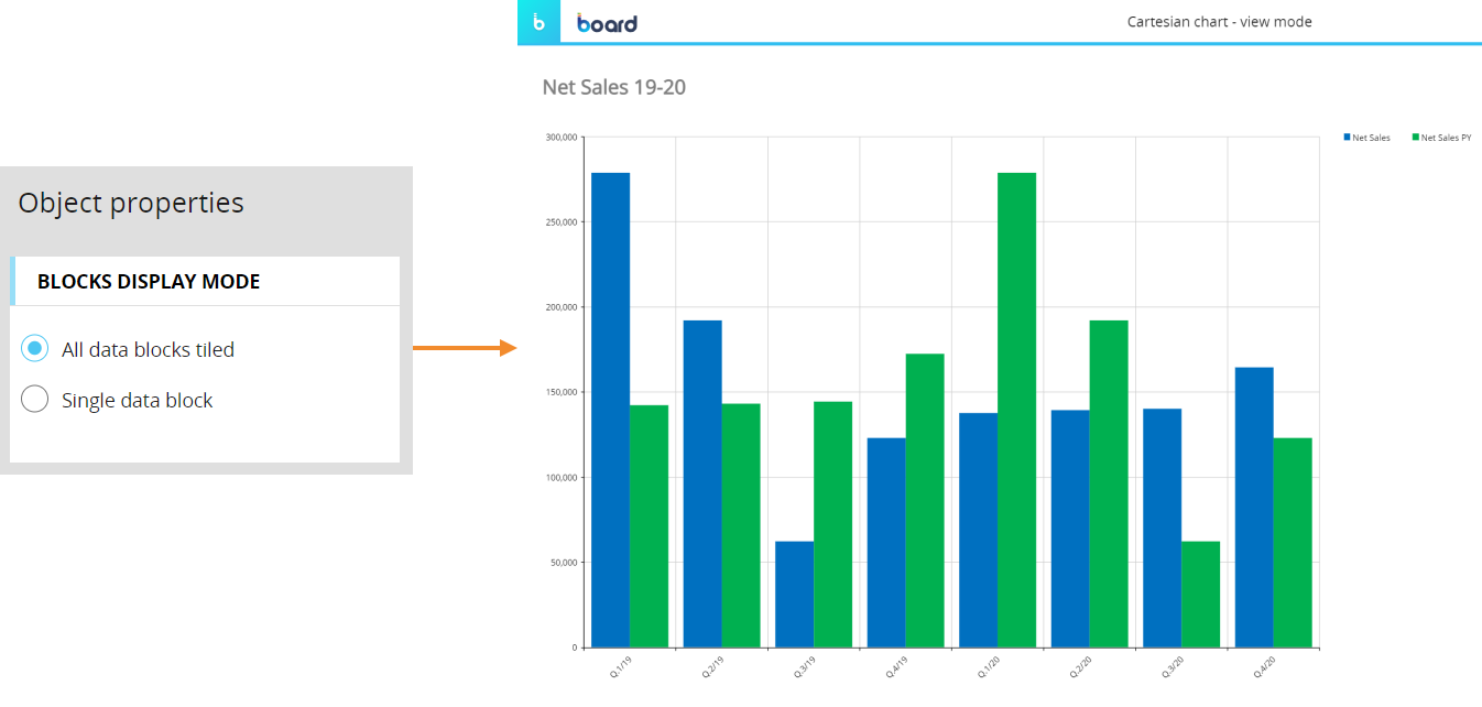
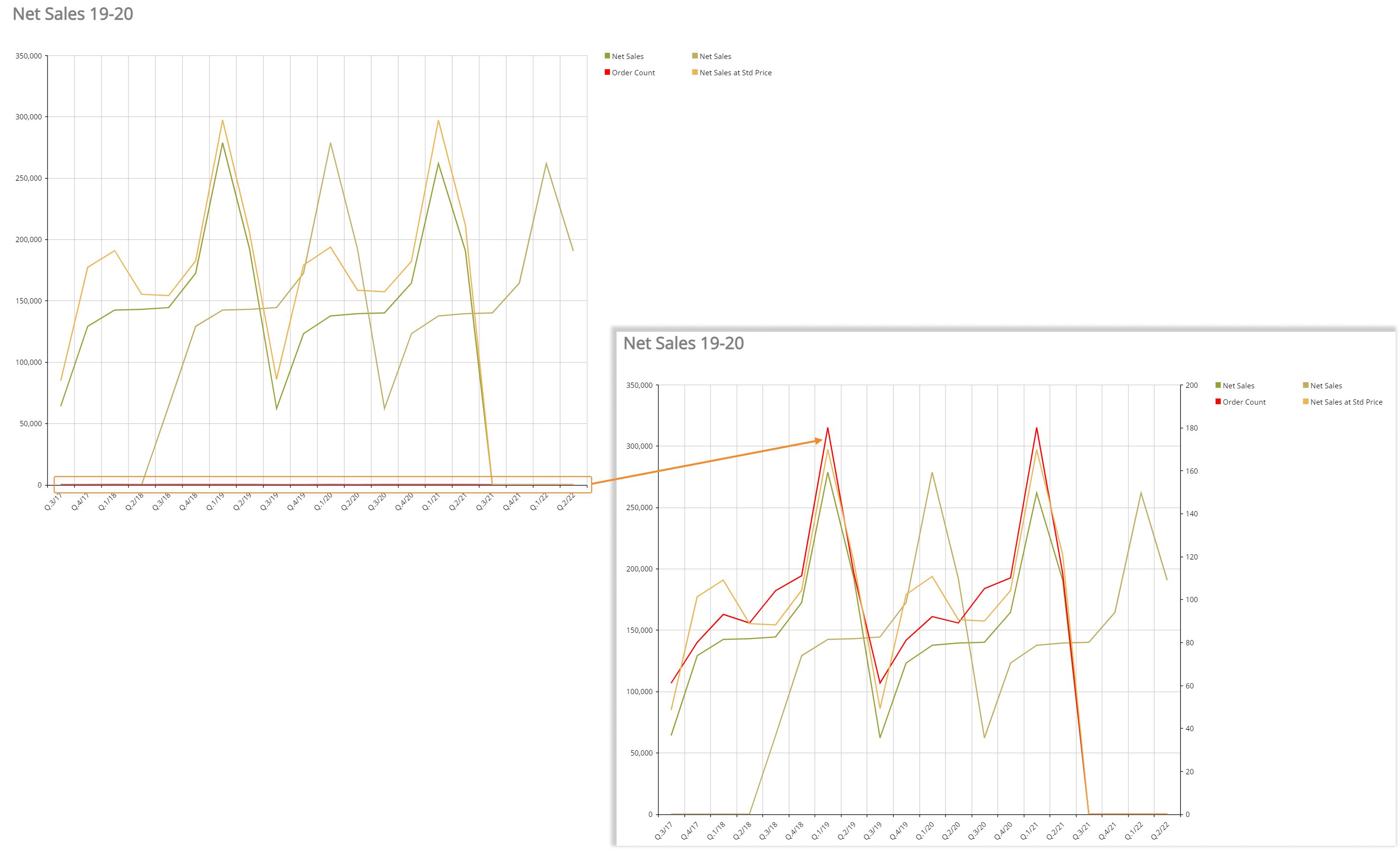
- Show on secondary axis. If enabled, displays selected series on a secondary axis. This is particularly useful when you have Blocks with values that differ significantly from each other.
For example, in the following chart the option has been enabled on the Order Count series. As you can see, the series is barely noticeable in the first chart, while it is much more visible with the Show on secondary axis option turned on.
- Marker type. Select a marker type to identify data points of each category for selected series (square, triangle, circle). This option is only available for line-based series types
- Show labels. Enable this option to display data labels on top of data points of each category for selected series. Data labels display the data point's value
- Rotation angle. Defines a rotation angle for data labels
- Label color. Applies the selected color to the background of data labels
- Pattern. Select from various fill patterns to customize series of a Bar chart. This option is only available for Bar series types
Under the Axis menu, the following options are available:
- In the Category axis sub-menu:
- Visible. Uncheck this option to hide the Category axis
- Reverse. Reverses the Categories order in the axis
- Label interval. Defines the interval between visible X axis labels
- Label fit mode. Defines how X axis labels are displayed: on multiple lines or tilted.
- Rotation angle. Defines the rotation angle of X axis labels when the Label fit mode is set to "Rotate"
- Show grid line. Shows/hides vertical lines of the grid in the chart background
- Dash style. Applies a pre-configured style to vertical lines of the grid in the chart background
- Axis label. Defines the X axis title
- In the Primary Y axis sub-menu:
- Visible. Uncheck this option to hide the Y axis
- Reverse. Reverses the values order in the Y axis
- Logarithmic scale. Switches values in the Y axis to a base-10 logarithmic scale
- Autorange. When enabled, the system automatically defines the axis values range
- Minimum-Maximum. If the "Autorange" option is disabled, you can manually define the minimum and maximum value displayed on the axis
- Step. If the "Autorange" option is disabled, you can manually define the step of the values displayed on the axis
- Label fit mode. Choose "Rotate" to display Y axis labels as tilted
- Rotation angle. Defines the rotation angle of Y axis labels when the Label fit mode is set to "Rotate"
- Show grid line. Shows/hides horizontal lines of the grid in the chart background
- Dash style. Applies a pre-configured style to horizontal lines of the grid in the chart background
- Separator. Enable this option to display numeric and decimal separators for values on the axis
- Decimal. If the "Separator" option is enabled, you can manually define how many numbers should be displayed after the decimal separator
- Percentage. Enable this option to display a percent sign (%) after values on the axis
- Prefix-Postfix. You can manually enter characters that will be displayed before and/or after values on the axis
- Axis label. Defines the Y axis title
- For the Secondary Y axis sub-menu, please refer to the previous list of options.
Under the Elements menu you can customize the title, plot area and legend of your chart. The following options are available:
- In the Title sub-menu:
- Width-Height-Top-Left. These properties define the position and size of the title area
- Horizontal alignment. Sets the horizontal text alignment
- Vertical alignment. Sets the vertical text alignment
- Visible. Uncheck this option to hide the title area
- In the Plot sub-menu:
- Width-Height-Top-Left. These properties define the position and size of the plot area
- In the Legend sub-menu:
- Width-Height-Top-Left. These properties define the position and size of the Legend area
- Visible. Uncheck this option to hide the title area
- Large icons. Check this option to enlarge all elements of the legend
Pie
The Pie chart shares most of its options and properties with the Cartesian chart, with a few exceptions described in the following paragraphs.
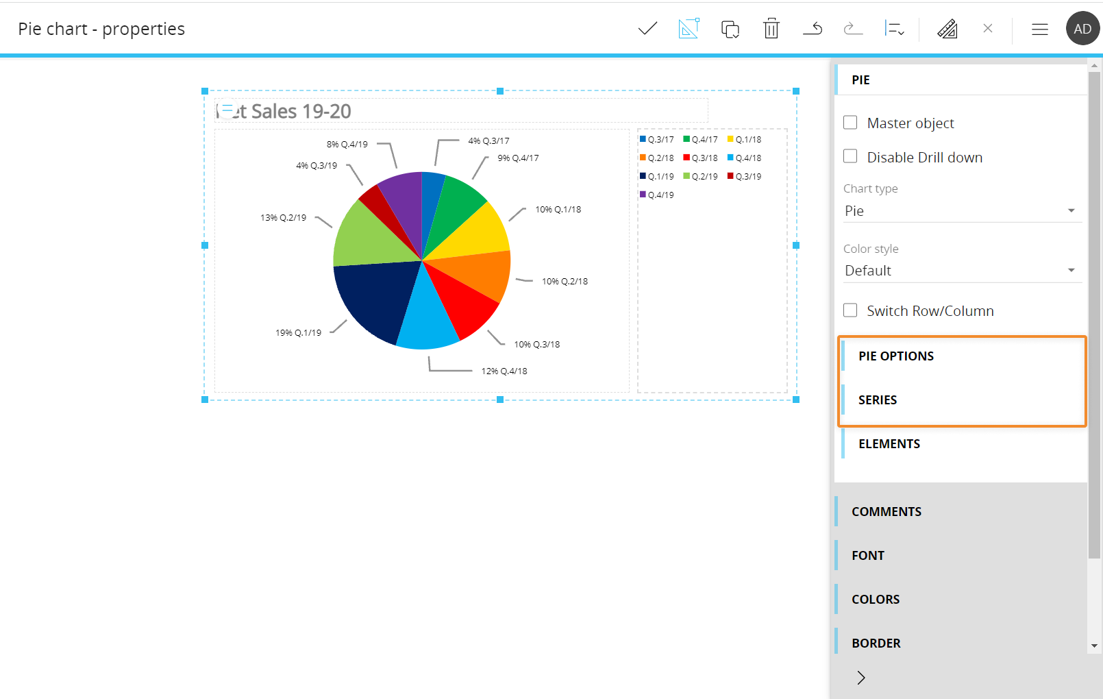
Under the Pie options menu you can customize a few format options for the chart. They are the following:
- Hover mode. If you select "Fade other items", when you hover over a slice (category) or a data label all other slices and data labels will appear opaque
- Display mode. Defines data labels visibility and position (inside or outside the pie area)
- Label mode. Defines the information displayed in data labels
Under the Series menu, the following options are available:
- Show as doughnut. Enable this option to turn the pie chart into a doughnut chart (i.e. a pie chart with a blank circular area in the center)
- Select category. Select the category whose color you want to change in the "Color" option below
- Rotation angle. Defines the rotation angle of data labels
- Color. Applies the selected color to the selected category (slice of the chart)
Waterfall
The Waterfall chart shares most of its options and properties with the Cartesian chart, with a few exceptions described in the following paragraphs.
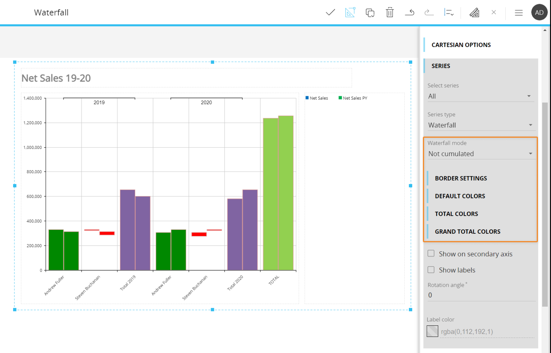
Under the Series menu, the following Waterfall-specific options are available:
- Waterfall mode. Choose how data will be plotted in a Waterfall chart. The available options are:
- Cumulated. Bars displayed in the chart represent the series value for each category, plotted starting from the summation of all previous series values.
Example 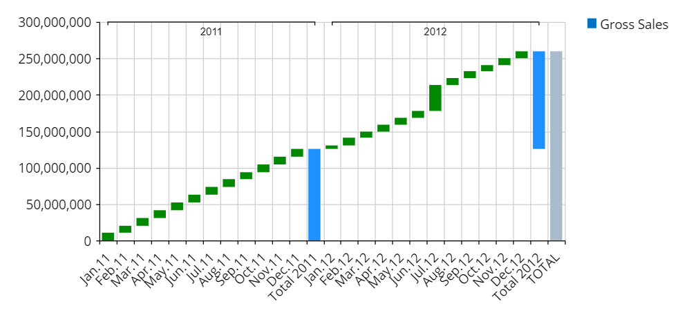
- Cumulated by group. When Entity Grouping is active on a chart, enabling this option will cause the cumulation to restart from the zero baseline of the Y axis at the beginning of each group
Example. Notice how the cumulation starts from a baseline of zero after 2011. 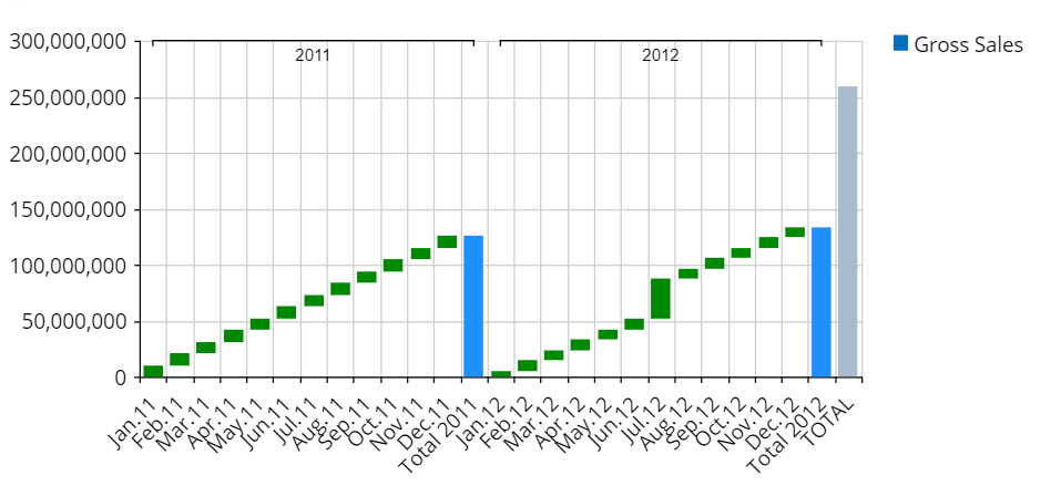
- Not cumulated. Bars displayed in the chart represent the difference between each series value and the previous one, plotted starting from the previous series value baseline
Example 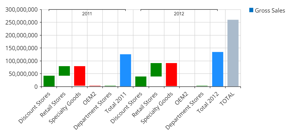
- Border settings. Allows you to customize the border width and color of selected series
- Default colors. Allows you to set one color for positive Block series and another color for negative Block series
- Total colors. Allows you to set one color for positive total series and another color for negative total series. Total series are displayed when there are at least two Entities set in the Categories field of the Layout editor
- Grand total colors. Allows you to set one color for positive grand total series and another color for negative grand total series
- Cumulated. Bars displayed in the chart represent the series value for each category, plotted starting from the summation of all previous series values.
Radar
The Radar chart shares most of its options and properties with the Cartesian chart, with a few exceptions described in the following paragraphs.
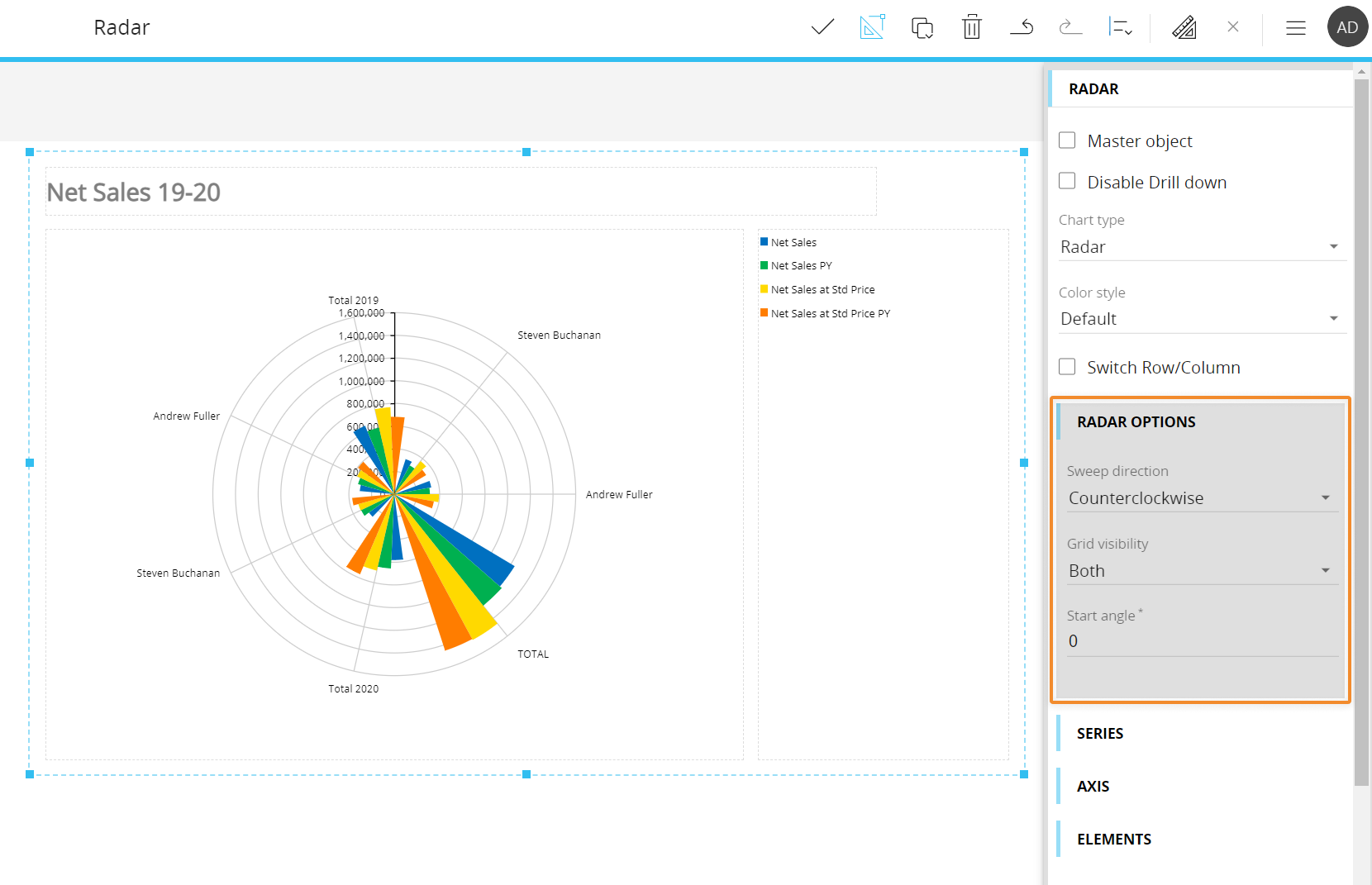
Under the Radar options menu, the following Radar-specific options are available:
- Sweep direction. Defines the Plot Areas or Lines orientation (Clockwise or Counterclockwise)
- Grid visibility. Lets you hide the grid in the chart background (None) or choose between different grid visualization options (Polar, Radial or Both)
- Start angle. Rotates the grid in the chart background based on the entered angle value and the sweep direction
Bubble chart
Bubble charts allow the representation of three independent values on a two-dimensional space. In a Board bubble chart, each bubble corresponds to a member of the Entity set in the "Points" field of the Layout, while the position on the X and Y axis is determined by Data Blocks of the Layout (Cubes values or Algorithms).
The color of bubbles can be determined either by a fourth numerical dimension (a Cube of the Layout or an Algorithm) or by a grouping Entity (the least nested Entity set in the "Points" field of the Layout).
The Radar chart shares most of its options and properties with the Cartesian chart, with a few exceptions described in the following paragraphs.
Bubble chart - Layout properties
The Layout editor for Bubble charts is different from the classic chart one, since it includes specific options and properties for configuring the Object to your liking.
They are highlighted in the image below:
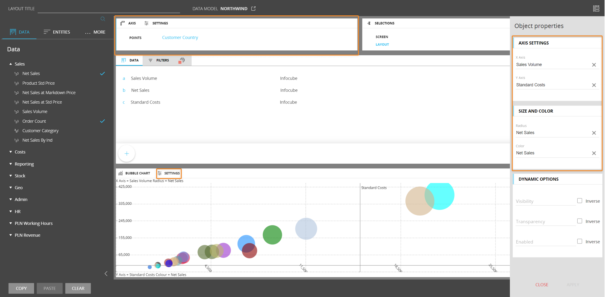
To take full advantage of the Bubble chart capabilities, we recommend adding at least three Data Blocks in the Layout: one for the X axis, one for the Y axis and one for the radius. You can also add another Block and use it as a driver for the bubbles color.
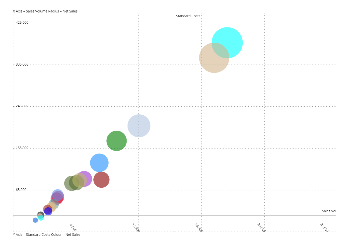
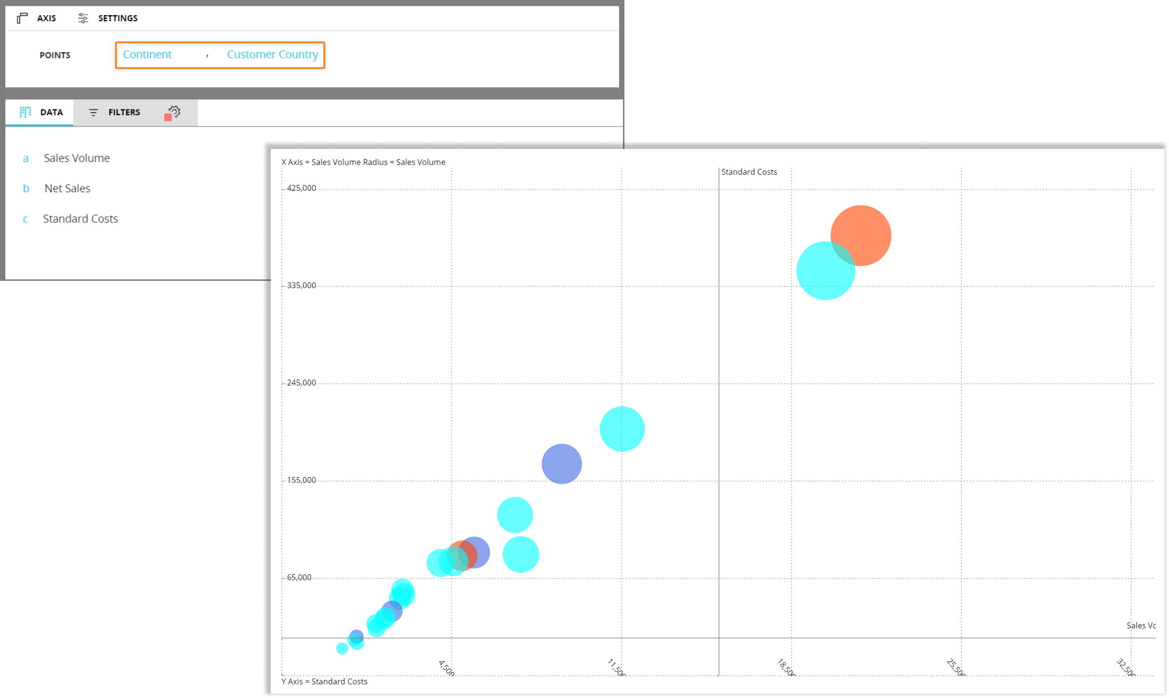
In the Axis area, set the Entity to display as bubbles in the "Points" field. If you add another Entity, Entity grouping will occur: in that case, bubbles will be colored by groups based on the parent Entity (i.e. the least nested Entity in the "Points" field).
In the following example, two related Entities are set in the "Points" field and, as a result of the grouping, bubbles in the chart are colored based on the "Continent" Entity. Since that Entity contains only three members (North America, South America and Europe), bubbles representing Countries are colored with one of the three colors available (light blue, orange or purple).
In the Object properties panel, the Axis settings menu lets you choose a Block to be assigned to the X or Y axis of the chart. The values of each Block determine the minimum and maximum scale values of the assigned axis.
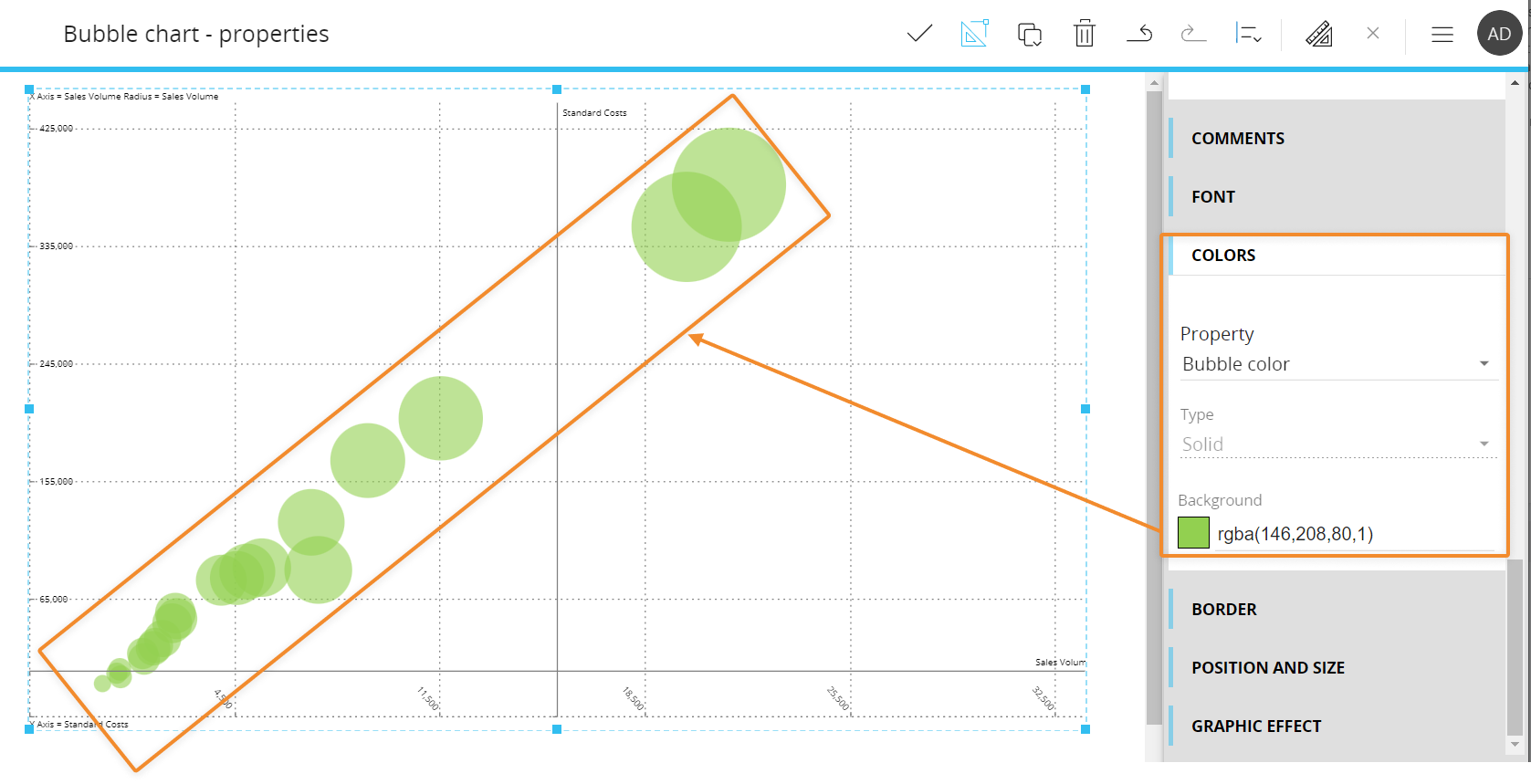
The Size and color menu lets you choose a Block that will be used as a driver for the bubbles radius and for the bubbles color.
Blocks hidden using the dedicated option in the Block settings panel won't be available in the Axis settings and Size and color menus.
To configure the bubbles color, you can set a color alert on the corresponding Block, otherwise the default color palette will be used. You can also configure a color that will be used for all bubbles from the Color menu in the Screen editing page.
Bubble chart properties
Additional Bubble chart properties are available from the contextual right panel of the Screen editing page once the Chart Object is selected and it's associated with a Layout. They are highlighted in the following image:
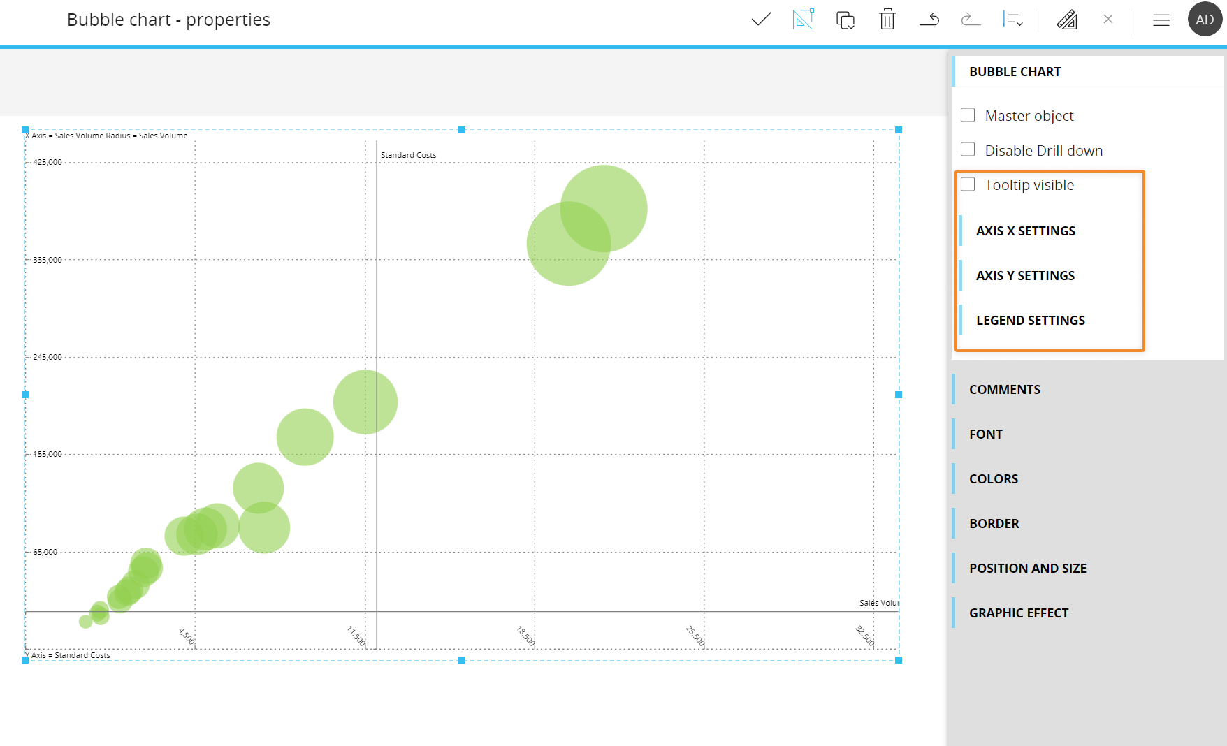
If enabled, the "Tooltip visible" option will display a tooltip under each bubble showing the Entity set in the "Points" field of the Layout or, in case of Entity grouping, the most nested Entity.
Under the Axis X settings menu, the following options are available:
- X position. Defines the Y axis value from which the X axis will be plotted
- Axis X visibility. Shows/hides the X axis in the chart area
- Axis X series label visibility. Shows/hides the X axis labels in the chart area
- Axis X title visibility. Shows/hides the X axis title
- Axis X major grid lines visibility. Shows/hides vertical lines of the grid in the chart background
- Axis X line visibility. Shows/hides a small solid line alongside each value displayed on the axis
- Autorange. When enabled, the system automatically defines the axis values range
- Minimum-Maximum. If the "Autorange" option is disabled, you can manually define the minimum and maximum value displayed on the axis
- Step. If the "Autorange" option is disabled, you can manually define the step of values displayed on the axis
- Rotation angle. Defines the rotation angle of X axis labels
- Axis label. Defines an additional X axis title that will be displayed at the bottom center of the chart area
Under the Axis Y settings menu, the following options are available:
- Y position. Defines the X axis value from which the Y axis will be plotted
- Axis Y visibility. Shows/hides the Y axis in the chart area
- Axis Y series label visibility. Shows/hides the Y axis labels in the chart area
- Axis Y title visibility. Shows/hides the Y axis title
- Axis Y major grid lines visibility. Shows/hides vertical lines of the grid in the chart background
- Axis Y line visibility. Shows/hides a small solid line alongside each value displayed on the axis
- Autorange. When enabled, the system automatically defines the axis values range
- Minimum-Maximum. If the "Autorange" option is disabled, you can manually define the minimum and maximum value displayed on the axis
- Step. If the "Autorange" option is disabled, you can manually define the step of values displayed on the axis
- Rotation angle. Defines the rotation angle of Y axis labels
- Axis label. Defines an additional Y axis title that will be displayed at the middle left side of the chart area
Under the Legend menu, you can show/hide the legend text at the top and bottom left of the chart area
Bullet chart
The Bullet chart is very similar to a Bar chart, but it displays additional visual elements to add more context to your data. This type of chart is very useful to visualize progress against target values, so it's typically associated with performance data.
In the following example, the blue bar represents the feature measure (main data), while red lines that run perpendicular to the orientation of the chart represent the comparative measure (target marker to compare against the feature measure).
The segmented colored bars behind each blue bar are used to display ranges/thresholds. Each color shade is typically used to assign a performance range rating: darker shades are associated with low ratings, while lighter shades are associated with higher ratings.
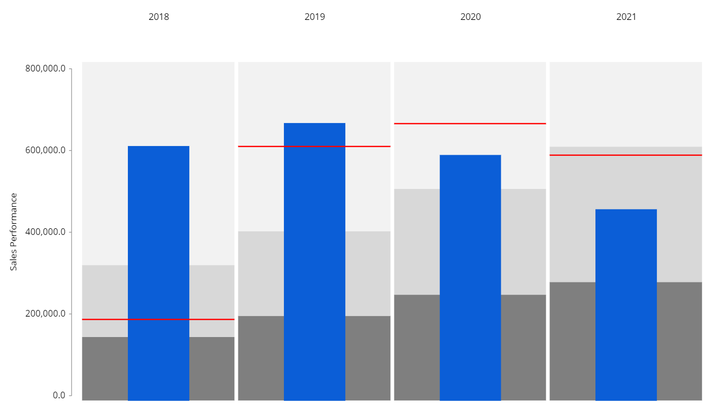
In the example above, you have hit your goal in 2018 and 2019, but fell short of your targets in 2020 and 2021.
Bullet chart - Layout properties
The Layout editor for a Bullet chart includes a specific menu for configuring the feature measure, the comparative measure and ranges, as displayed in the following image:
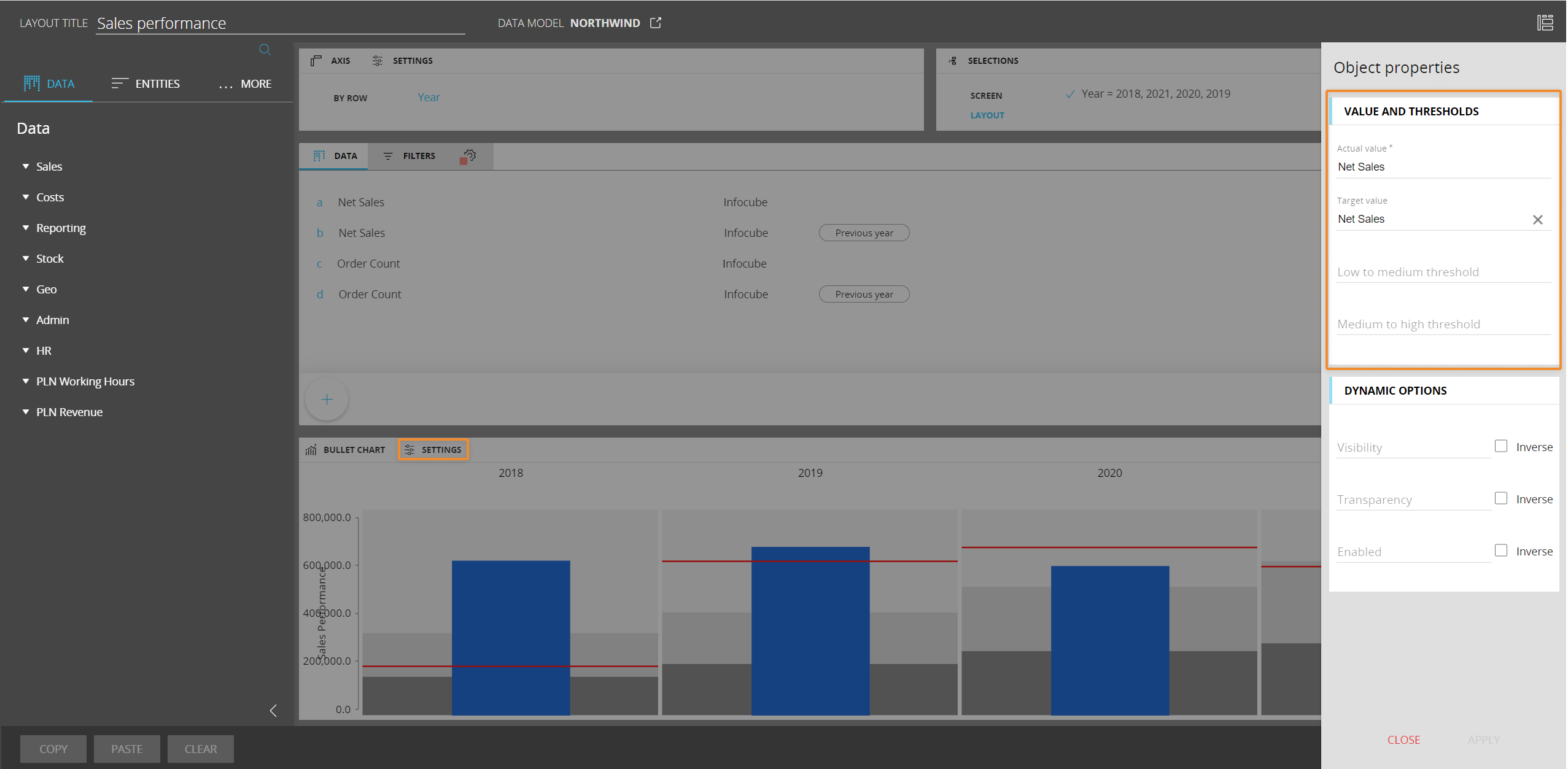
Under the Value and thresholds menu, you can define:
- The actual value (required field). The Data Block whose values will be displayed as the feature measure
- The target value. The Data Block whose values will be displayed as the comparative measure
- The low to medium threshold. The Data Block whose values will be displayed as the darker bar behind the actual value bar. You can also configure ranges from the Bullet chart properties available in the contextual right panel of the Screen editing page
- The medium to high threshold. The Data Block whose values will be displayed as the lighter bar behind the actual value bar. You can also configure ranges from the Bullet chart properties available in the contextual right panel of the Screen editing page
Blocks hidden using the dedicated option in the Block settings panel won't be available in the Value and thresholds and color menus.
You cannot add more than one Entity By Row in a Layout associated with a Bullet chart.
Bullet chart properties
Additional Bullet chart properties are available from the contextual right panel of the Screen editing page once the Chart Object is selected and it's associated with a Layout. They are highlighted in the following image:
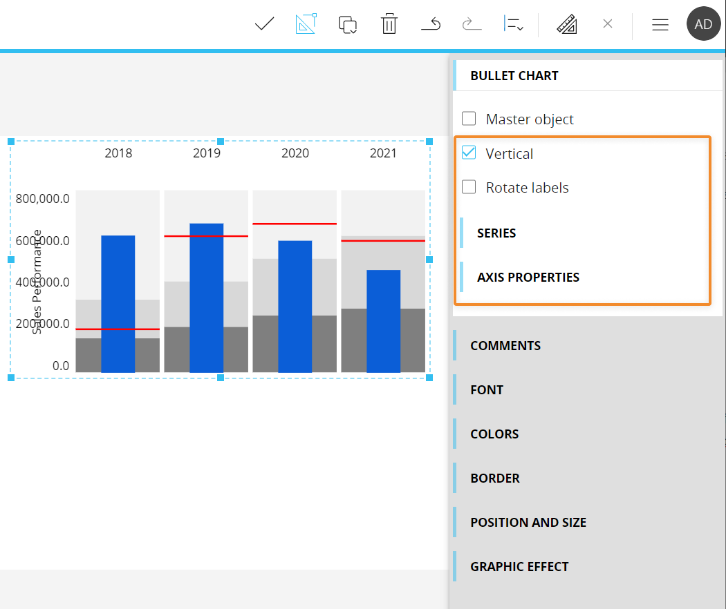
The following properties are available for the Bullet chart:
- Vertical. If disabled, switches the chart orientation so that bars will be displayed horizontally
- Rotate labels. If enabled, flips labels of the Entity set By Row by 90°
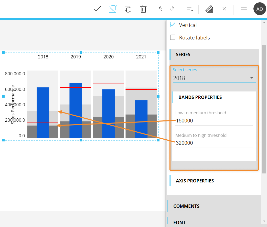
Under the Series menu, select each series to manually configure the low to medium and medium to high thresholds for ranges, as displayed in the following image:
Under the Axis properties menu, the following options are available:
- Minimum-Maximum. You can manually define the minimum and maximum value displayed on the value axis
- Step. You can manually define the step of values displayed on the axis
- Prefix-Postfix. You can manually enter characters that will be displayed before and/or after values on the axis
- Digits. You can manually define how many numbers should be displayed after the decimal separator
- Axis label. Defines the value axis title
Heatmap
The Heatmap chart is a two-dimensional graphical representation of data where values are encoded in colors, resulting in a helpful and insightful view of information.
Each square in the chart can represent a numerical or logical value that determines the cell color: larger values are associated with darker coloring, while smaller values are associated with lighter coloring.
Heatmap chart - Layout properties
The Layout editor for a Heatmap chart includes a specific menu for configuring which Block will be plotted in the chart, as displayed in the following image:
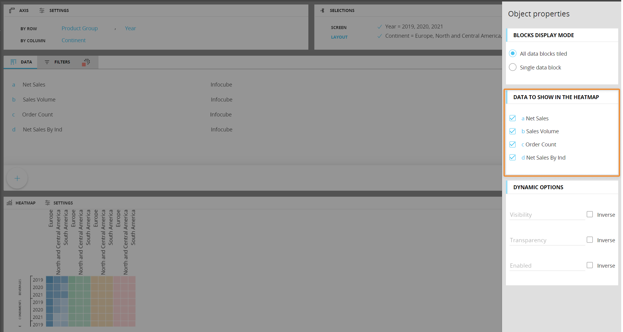
Under the Data to show in the Heatmap menu, simply check the Data Block you want to be included in the chart.
You can add as many Entities as you want in both axes, but the Layout will only consider the most nested one in the By Column field. If you add multiple Entities in the by Row field, Entity grouping will occur.
Blocks hidden using the dedicated option in the Block settings panel won't be available in the Data to show in the Heatmap menu.
Heatmap chart properties
Additional Heatmap chart properties are available from the contextual right panel of the Screen editing page once the Chart Object is selected and it's associated with a Layout. They are highlighted in the following image:
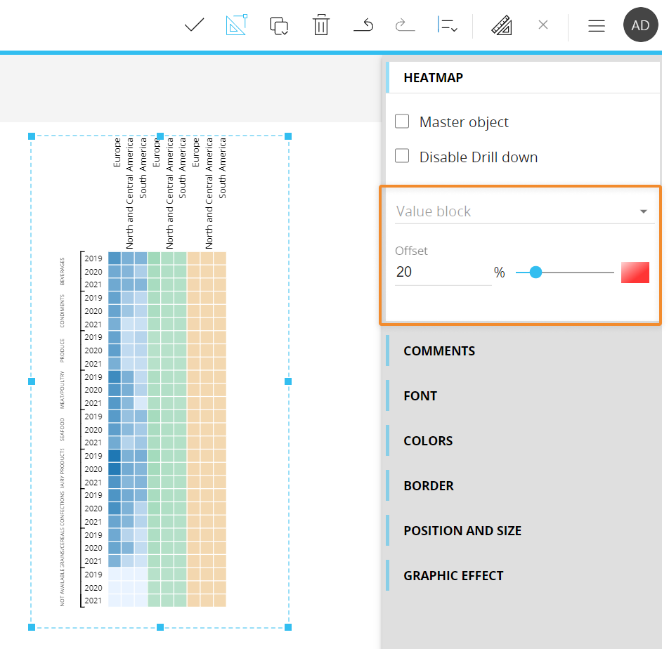
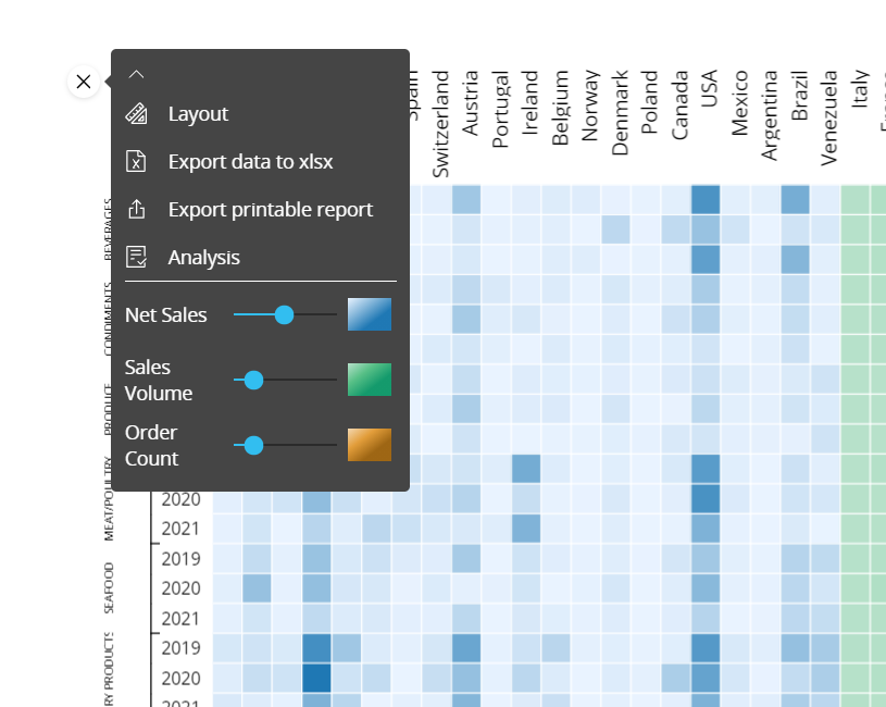
Choose available Blocks to adjust the color intensity for each one using the Offset field or by dragging the slider's thumb. You can also change the color assigned to each Block by clicking the box next to the slider.
The slider is also available to users in Play mode, from the sliding toolbar of the chart.
Treemap
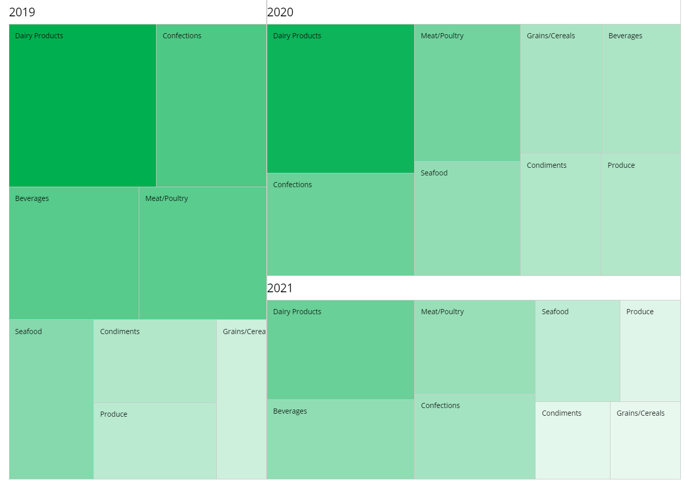
The Treemap chart is a diagram that shows data as a set of nested rectangles of different sizes and different shades of a color. It can be really useful in reports showing rankings, classification, item evaluations and adoption across all business departments, even those less dependent on values or figures.
For example, you can use a Treemap to compare sales from various salesmen. A salesman with a large sales amount would be displayed as a large rectangle, while another salesman with a small sales amount would be displayed as a small rectangle.
In general, the Treemap is useful when you want to display a positive value (the area of rectangles) and a second quantitative value (the color of rectangles).
The tree map is scaled to best fit the available space, so the rectangles size should be considered in relation to each other, rather than as an absolute number.
Treemap chart - Layout properties
The Layout editor for a Treemap chart includes a specific menu for configuring which Block will be plotted in the chart and which Block values will affect the intensity of the color.
Under the Data Blocks menu, simply click on the drop down menu to select the desired Data Blocks.
Treemap chart properties
Additional Treemap chart properties are available from the contextual right panel of the Screen editing page once the Chart Object is selected and it's associated with a Layout. They are highlighted in the following image:
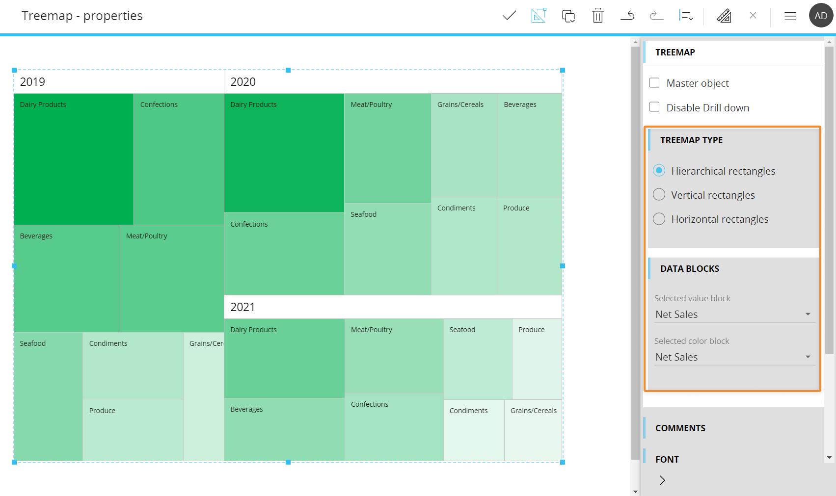
Under the Treemap type menu, the following options are available:
- Hierarchical rectangles. Arranges rectangles in a hierarchical order, with those representing a larger value (with a wider area) positioned in the upper left corner. In case of Entity grouping, the hierarchical arrangement is iterated for each member of the least nested Entity set By Row
- Vertical rectangles. Arranges rectangles vertically, with those representing a larger value (with a wider area) positioned at the top. In case of Entity grouping, the hierarchical arrangement is iterated for each member of the least nested Entity set By Row
- Horizontal rectangles. Arranges rectangles horizontally, with those representing a larger value (with a wider area) positioned to the left. In case of Entity grouping, the hierarchical arrangement is iterated for each member of the least nested Entity set By Row
Under the Data Blocks menu, you can select which Blocks will be used as a driver for the rectangles color and area.
To configure the rectangles color, you can set a color alert on the Block set in the "Selected color block" drop down under the Data Blocks menu, otherwise the default color palette will be used. You can also configure the main color that will be used for all rectangles from the Color menu in the Screen editing page.
Interacting with a Chart in Design mode
In Design mode, the charts provide the same interactive features available in Play mode, with a few notable differences regarding Drill functions.
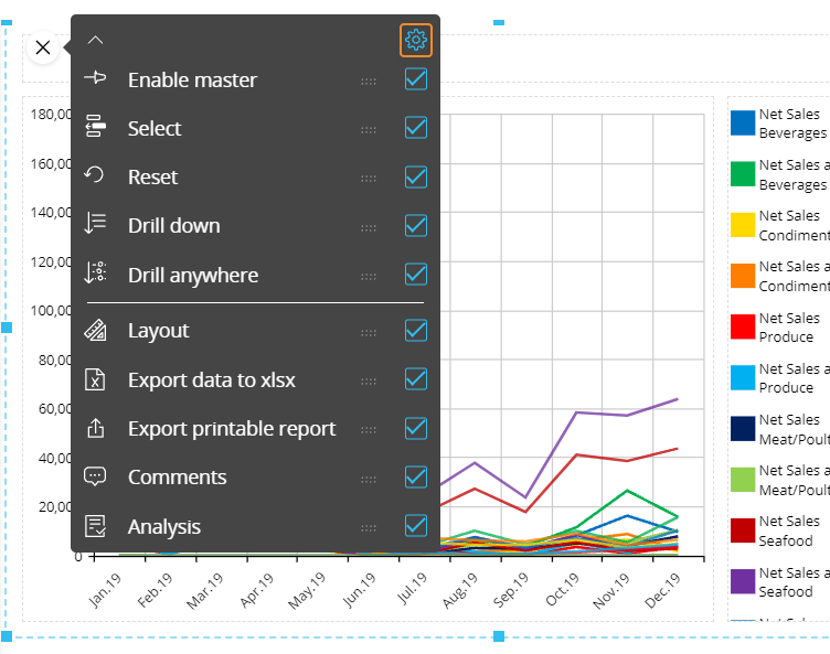
You can also configure which options will be available in the contextual menu (sliding toolbar) in Play mode. To do so, hover over the chart and click the contextual menu icon ( ) in the top left corner, then expand it by clicking on the downward facing arrow: the configuration panel is accessible from the gear icon in the top right corner.
Default drill-down
You can configure a drill down path that will be saved in the chart configuration: that will be the default drill that will be performed in Play mode, when end users click on the Drill down button.
To configure the default drill, proceed as follows:
- Depending on the chart type, double-click on a data point (a bubble, a bar, a rectangle, etc.) or select it and click the Drill anywhere icon (
 )
) - From the pop up window, select the Entity to drill down on and click OK. The configured drill is performed and data is displayed in a Data View
- Close the drill down window and save the Screen. The configured drill is now the default drill, both in Design and Play mode
End users will still be able to configure other drill down paths in Play mode, if they're allowed to do so. See next paragraph for more details.
Screen selections and selections made by the user using Selector Objects (if any) also apply to data in drill down windows.
Limit Drill down entities
You can limit drill down paths that end users are allowed to configure by selecting the Entities the user can drill down on.
To do so, while in Design mode, check the "Limit drill down entities" checkbox in the drill anywhere configuration window and select the Entities you want to show to the end user. These entities will be the only ones available during the drill anywhere configuration in Play mode.
Drill-to-screen
To allow users to drill-down from one chart to another Screen within the same Capsule with a selection on the selected chart element, proceed as follows:
- Depending on the chart type, double-click on a data point (a bubble, a bar, a rectangle, etc.) or select it and click the Drill anywhere icon ()
- From the pop up window, select the Screen tab and choose the destination Screen. Check the "Same tab" checkbox to open the destination Screen in the same browser tab.
The Drill to screen mode, if enabled, will open the destination Screen with a selection on the chart element selected or double-clicked by the user in the chart.
The Go to screen mode, if enabled, will open the destination Screen when the user double-clicks on a data point or selects it and clicks on the Drill-down icon. The destination Screen won't inherit any selection from the chart. - Click OK to save the Drill-to-screen configuration.
This feature allows you to nest your analysis in a more powerful way than the standard drill-down, which only changes the level of granularity of a report. In a drill-to-screen navigation the data represented (values, indexes) and types of objects (Charts, Dashboards, Data Views) may vary as the user drills from a top level view to another screen at a more detailed level.
Screen selections and selections made by the user using Selector Objects (if any) also apply to data in the target Screen.
Drill-procedure
It is possible to trigger a procedure from a chart, when the user double-clicks on a data point or selects it and clicks on the Drill-down icon. The procedure is launched with a selection filter applied based on the clicked chart element.
If a drill-procedure containing two or more procedures is configured, when the user double-clicks on a chart element, a pop-up window allows the user to select the procedure to run from a configured list.
To configure a drill-procedure, proceed as follows:
- Depending on the chart type, double-click on a data point (a bubble, a bar, a rectangle, etc.) or select it and click the Drill anywhere icon ()
- From the pop up window, select the Procedure tab and choose the desired Procedures.
- If the checkbox in the middle is unchecked, the dropdown menu on the left allows to choose from procedures saved at the Capsule level
- If the checkbox in the middle is checked, select a Data model from the dropdown menu on the right. By doing so, only procedures belonging to the chosen Data model will be shown in the dropdown menu.
After you've chosen the desired procedure, click the ADD button on the right. Repeat the process for each procedure you want to add to the drill
- Click OK to save the Drill-procedure configuration.
Screen selections and selections made by the user using Selector Objects (if any) also apply to data in drill down windows.
Drill through
It is possible to execute a Drill through from a chart, when the user double-clicks on a data point or selects it and clicks on the Drill-down icon. The Drill through is executed with a selection filter applied based on the clicked chart element.
Drill throughs are configured in the Drill through section of the Data model.
To configure a Drill through on a chart element, proceed as follows:
- Depending on the chart type, double-click on a data point (a bubble, a bar, a rectangle, etc.) or select it and click the Drill anywhere icon ()
- From the pop up window, select the Drill through tab and choose the desired Drill through
- Click OK to save the Drill through configuration.
Screen selections and selections made by the user using Selector Objects (if any) also apply to data in drill down windows.
Learn more about: