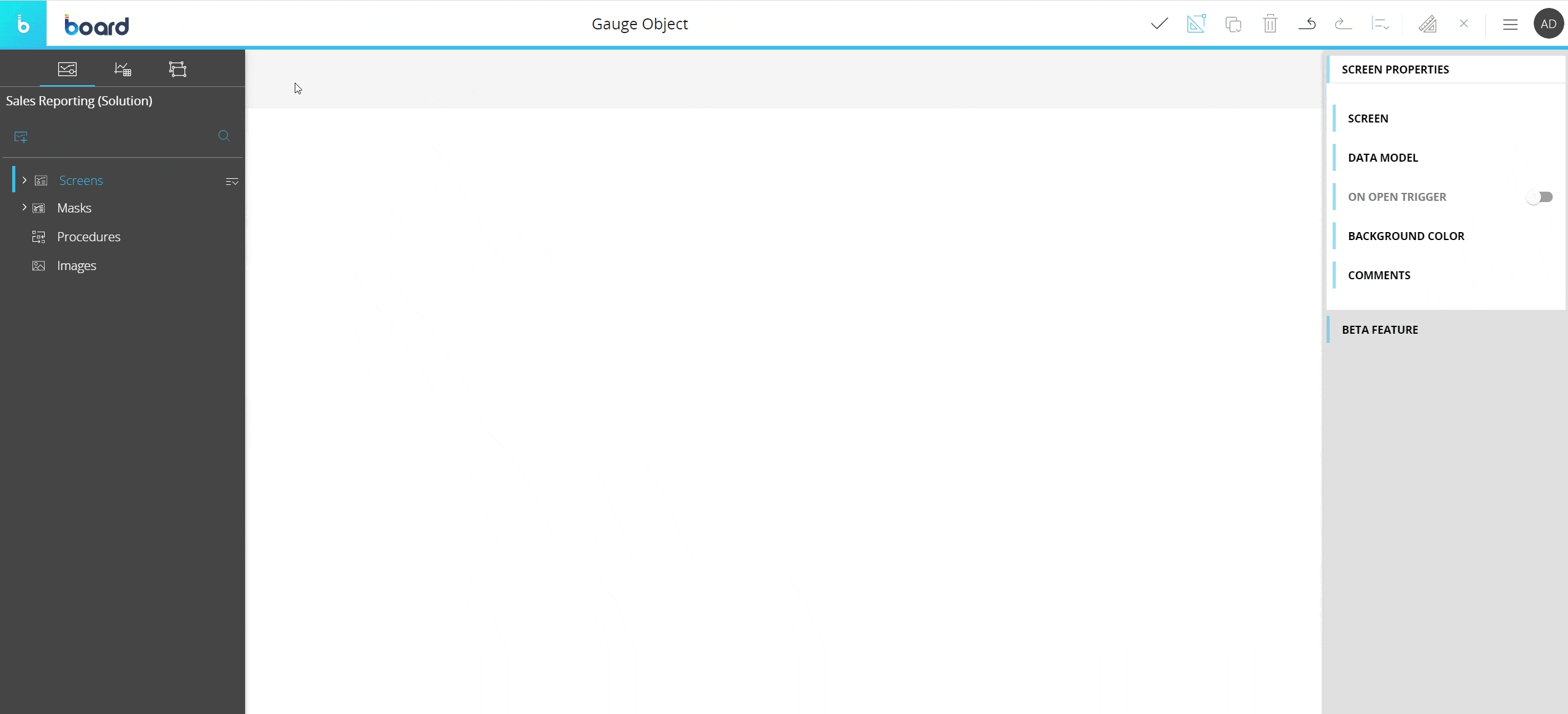
Creating a Gauge Object
This topic describes how to add a new Gauge Object to a Screen or a Container and its specific properties.
To create a new Gauge Object, you need to access a Screen in Design mode.
Once you're in the Screen editing page, locate the Gauge Object from the Screen Objects list in the left panel, then drag and drop it onto your Screen or Container.
When you create a Gauge Object, it is initially empty. The next step is to configure a Layout that will define the data to be displayed. To do so, select the Gauge Object and click the "Configure layout" button ( ) located in the Top Menu of the Capsules workspace.
See The Layout Object, Configure a Layout and About data blocks of a Layout for more details on the Layout Object.
The Gauge Object, just like every other Object, can be moved, resized, duplicated via copy/paste and easily aligned with other Objects on the Screen.
See Configure Screen Objects for more details.
Gauge Layout
The Layout editor for the Gauge Object is slightly different from the classic one, in that it offers some specific options and properties.
The main differences are highlighted in the image below:
No Axis area
The Gauge Object doesn't support Entities By Row or By Column.
The Data Area
The Gauge Object can display data from up to 3 Blocks and supports only numeric Cubes or Algorithms in the Data Area.
Although the Gauge Object can only display data from 3 Blocks, you can add as many Blocks as you need for calculations or reference: simply hide them to prevent their values from being displayed.
To complete the Gauge Layout configuration, at least one Block must be set in the Value field under the Values and thresholds menu in the Object properties panel. See the next paragraph for more details.
If your Layout has only one Block, you won't even have to configure the Values and thresholds menu options in the Object properties panel, as the Block will automatically be set in the Value field.
If your Layout has two, three or more Blocks, they will automatically be set in the Value, Second Value and Third Value fields under the Values and thresholds menu following the order in which you added them to the Data area.
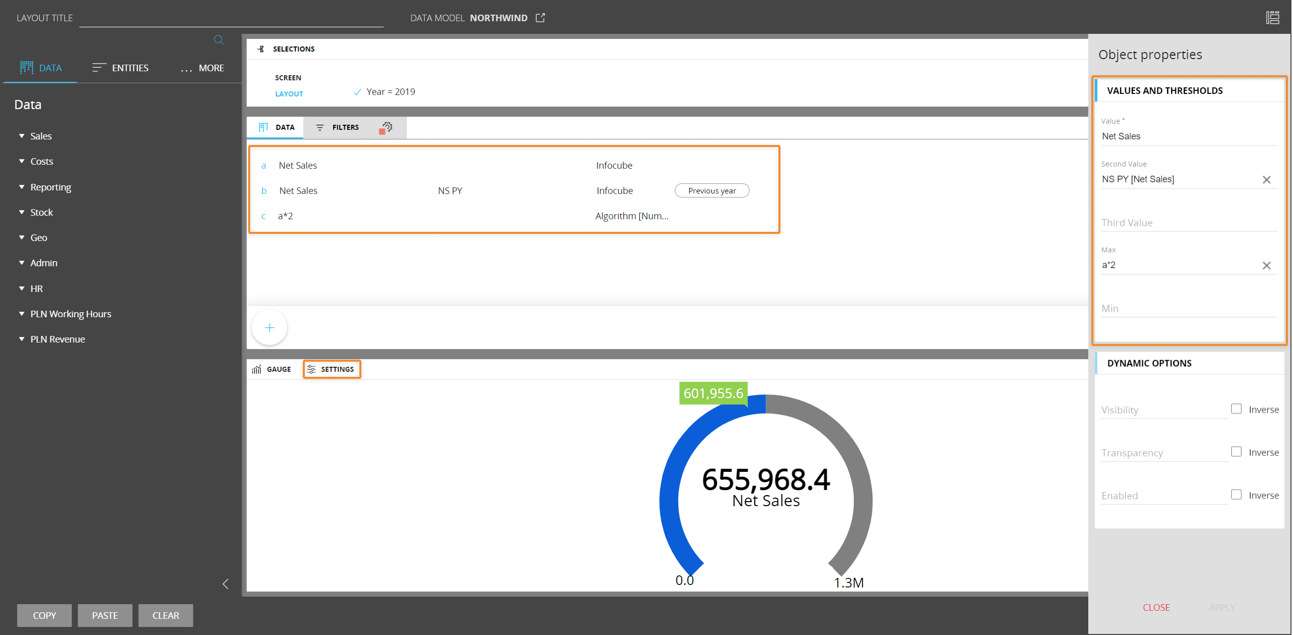
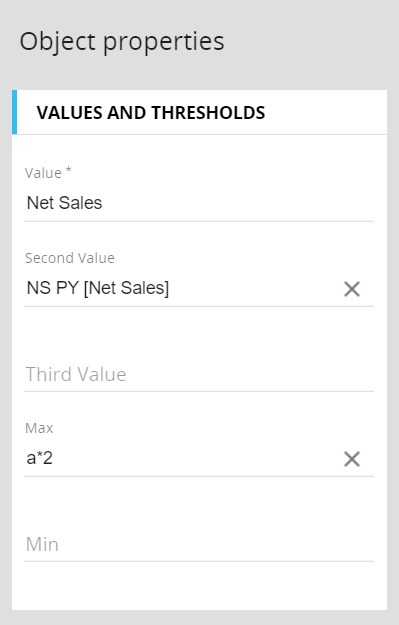
Object properties
In the Layout editor, under the Object properties panel, the Values and thresholds menu allows you to configure which data to be displayed in the Gauge Object and their position.
This is configured by assigning a Block to the following fields:
- Value (required field). Here you can define which Block's value will be represented as a colored bar in the Gauge
- Second Value. Here you can define which Block's value to be displayed in a label or as a marker along the progress bar
- Third Value. Here you can define which Block's value to be displayed in a second label or as a second marker along the progress bar
- Max. Here you can define which Block's value will be represented as the maximum value of the progress bar. If no Block is set, the maximum value is automatically assigned by Board
- Min. Here you can define which Block's value will be represented as the starting value of the progress bar. If no Block is set, the minimum value is automatically assigned by Board
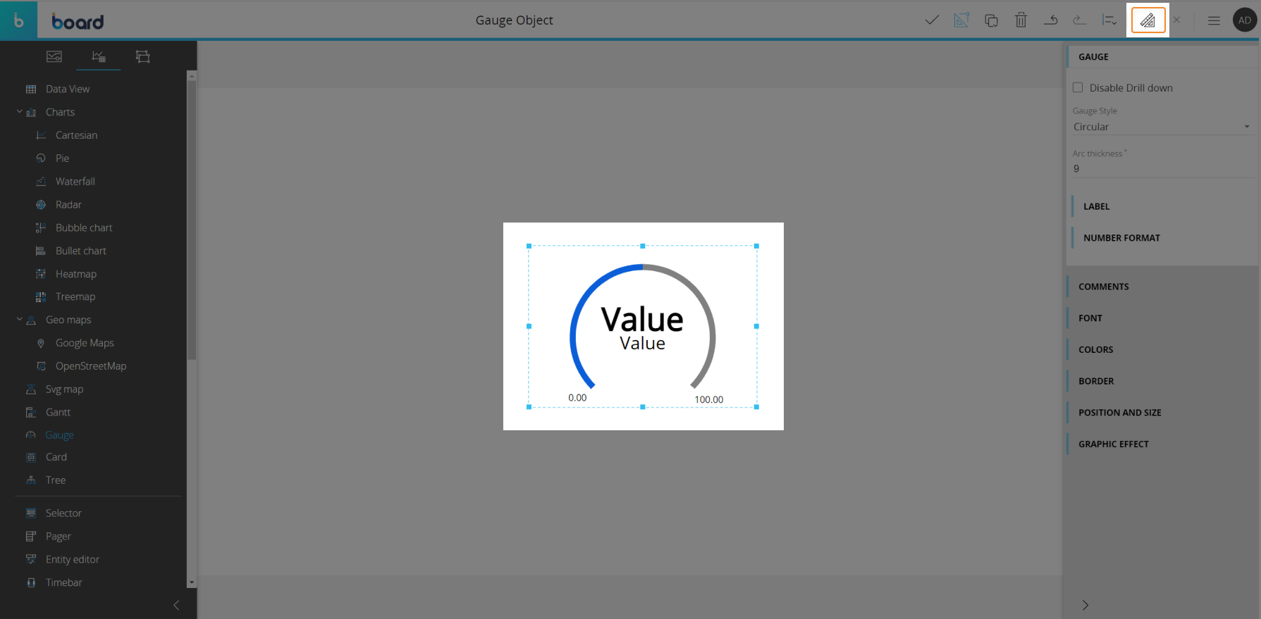
Gauge properties and settings
Gauge properties are available from the contextual right panel of the Screen editing page once the Object is selected and it's associated with a Layout.
The Object supports all options common to all Screen Objects except the Master option.
Properties specific to the Gauge Object are highlighted in the following image and explained below:
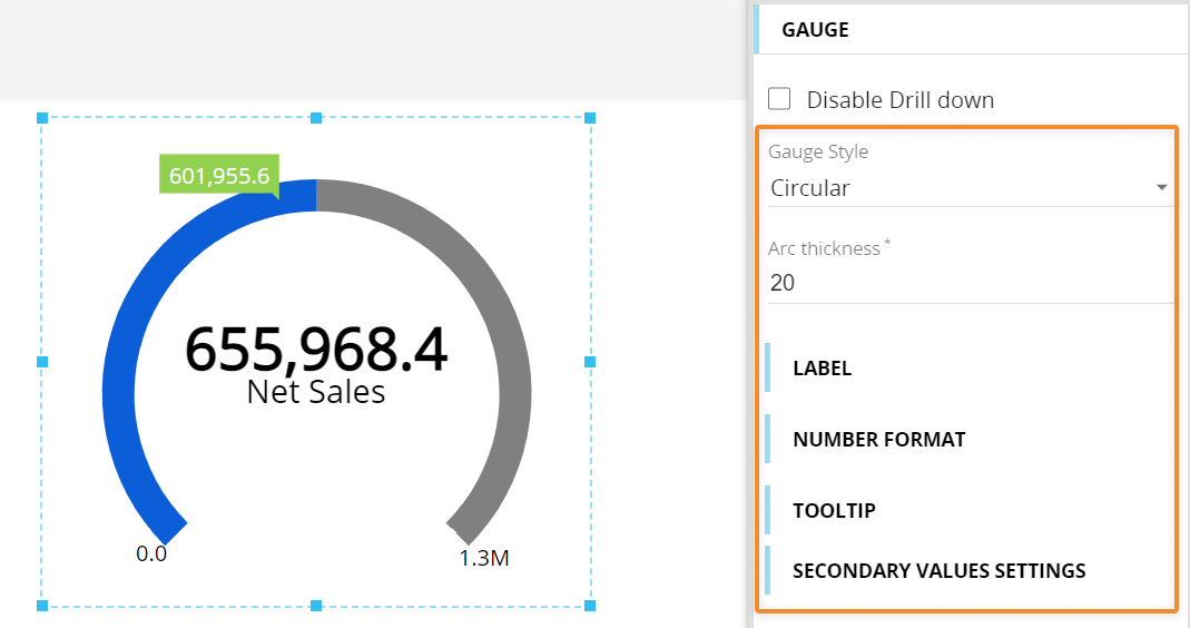
- Gauge style. Select one Gauge Style from the four ones available (Circular, Circular half, Linear vertical and Linear horizontal)
- Arc thickness. Defines the thickness of the progress bar
Under the Label menu, the following options are available:
- Label. Enter a custom label to be shown under the numeric value, otherwise the name of the Block set in the Value field (or its custom heading) in the Layout will be used
- Label opacity. Enter a percentage or drag the slider's thumb to set the Label opacity level
Under the Number format menu, the following options are available:
- Percentage. Displays the numeric value as a percentage of the maximum value represented in the progress bar
- Millions. Shows the numeric value in millions
- Decimals. Defines the number of decimals places to be displayed
- Prefix-Postfix. You can manually enter characters that will be displayed before and/or after the numeric value
- Value opacity. Enter a percentage or drag the slider's thumb to set the numeric value opacity level
- Min-Max submenu. Check the Set Min-Max values checkbox and enter the desired values to override the Min and Max configuration in the Layout definition
Under the Tooltip menu, you can enable a popover that appears when you hover over a secondary value label or marker. The popover will display relevant information related to the associated Block, such as its total value and its heading. You can also enter a percentage or drag the sliders' thumbs to set the opacity level for the tooltip and the tooltip font.
Under the Secondary values settings menu you can choose how secondary values will be displayed: as a text cloud tooltip or as a triangle marker.
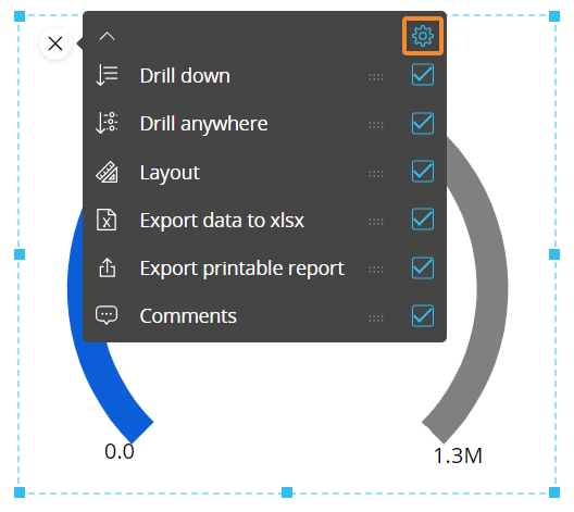
Interacting with the Gauge Object in Design mode
In Design mode, the Gauge Object provides the same interactive features available in Play mode, with a few notable differences regarding Drill functions: the Gauge Object doesn't support the configuration of a default drill set by a Capsule developer, so drills cannot be executed in Design mode.
If the Drill down feature is not disabled, end-users will be able to freely configure and apply drills and Drill throughs in Play mode.
You can also configure which options will be available in the contextual menu (sliding toolbar) in Play mode. To do so, hover over a Gauge Object and click the contextual menu icon ( ) in the top left corner, then expand it by clicking on the downward facing arrow: the configuration panel is accessible from the gear icon in the top right corner.
Learn more about: