In every version of board default entity sort option can be set by
[none] , displays occurrences in the order in which they are created,
code : sorts the entity members according to the code field.
desc : sorts the entity members according to the description field.
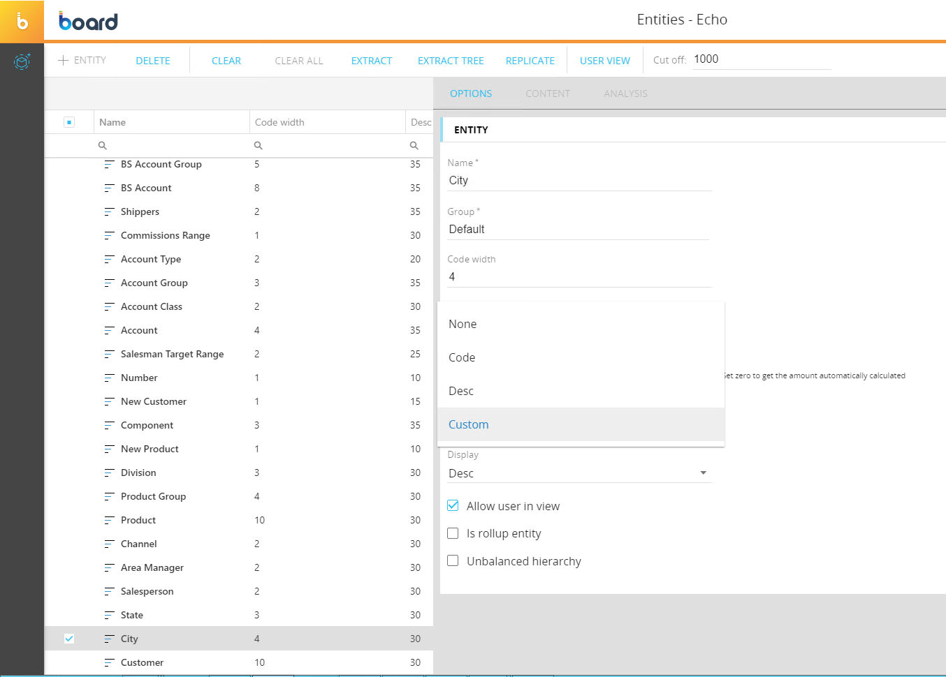
Board 11.3 allows a new option named Custom+
Custom sort can be activated selecting the item "Custom from the drop down list Sort By
Once activated the sort can be customized in two ways:
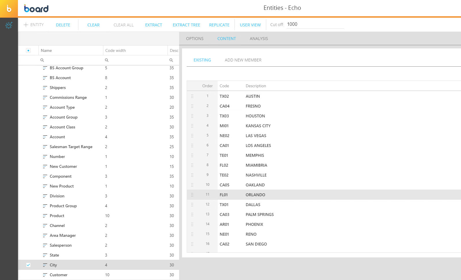
1) Manually from the content tab:
Drag and drop the element to the position it will have in the list, for example you can move the first element in position 3 by dragging it from the top to the third position. Use the six dot icon on the left to drag an element. You may also decide the position of the element by inputting a value in the order field: for example if you want to move the first element in third position by inputting a 3 in the order field of the first element.
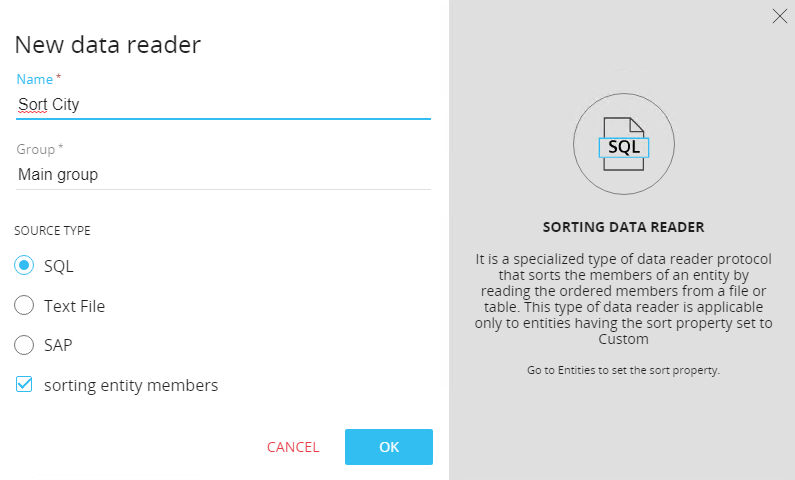
2) Via Datareader:
When at least one entity sort option is defined as "Custom" then a checkbox will appear when creating new datareaders. "Sorting entity members".
Once you set that checkbox only the entity fields can be used in the datareader. It won't be possible to add new items on the entity but this protocol will only be able to set the order of the items. The order in the file/query that the dr will read will be used in the custom sort.
The Gantt Chart object has been added on the web application. A Gantt chart is a useful graphical tool which shows activities or tasks performed against time. It is commonly used as visual representation of a project by breaking down activities and displayed on a chart which makes it is easy to understand and interpret.
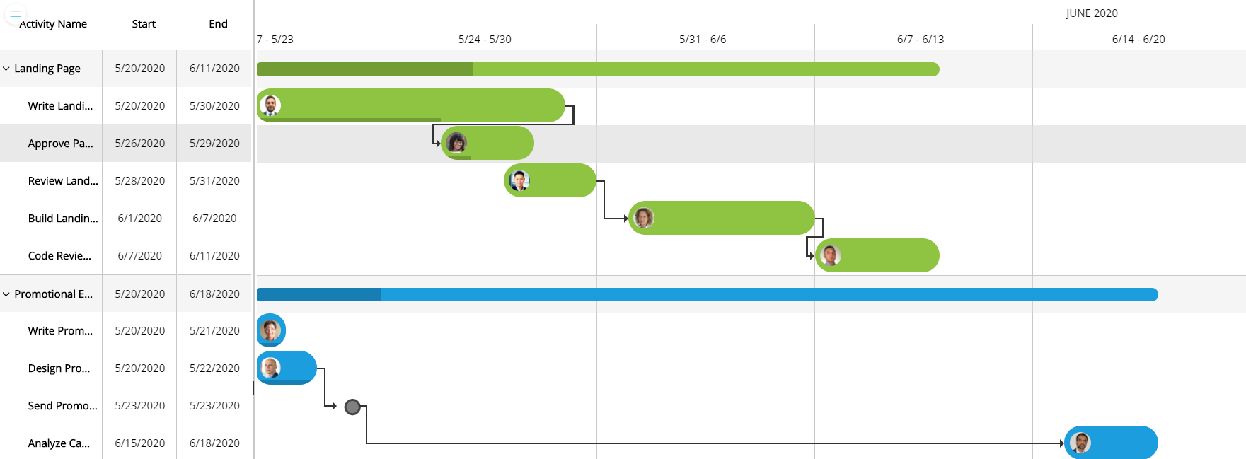
The object is available on the toolboxes list on the web editor. The configuration of the object remains consistent with all standard Board layout. Note that the activities are defined in the axes, while the blocks determine the display properties of the graph.
The layout configuration has the following constrains:
At least one entity by row in the axis
The columns are not available
Toolbox settings:
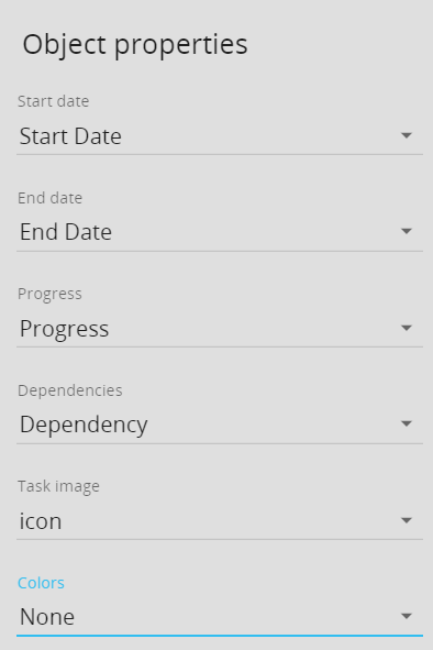
Start date: start date of the activity. Required field.
End date: end date of the activity. Required field.
Progress: shows percentage of tasks that have been completed
Dependencies: shows dependencies, which simply means the links among various activities. A block in text format, must indicate the code of the interconnected activity
Task image: by a blob cube, its possible display an icon on the task line
Colors: alert block to determine the color of the activity line
The Tree Node Chart object has been added on the web application. A Tree diagram is a type of graphic organizer that shows how items are related to one another.
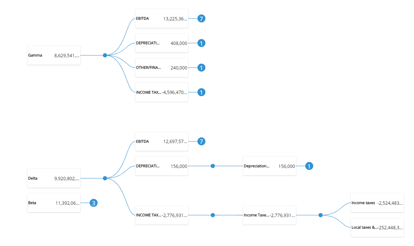
The object is available on the toolboxes list on the web editor. The configuration of the object remains consistent with all standard Board layout. Tree levels are defined by entities on the axis, while the blocks determine the elements displayed in the box.
Once the row axis is defined, a box that contains all the blocks defined in the layout is shown for each of the occurrences of that entity. Each block is shown in the layout editor as a rectangle that can be positioned and resized inside the box.
The layout configuration has the following constrains:
At least one entity by row in the axis
The columns are not available
From the properties of the object it is possible to define the level of aggregation during the first visualization, the style and the direction in which the tree will be represented (left to right/ top to bottom )
It is now possible to upload a GeoJSON file on the Geo Map object. The upload option is available on the GeoMap settings once in edit mode on a screen.
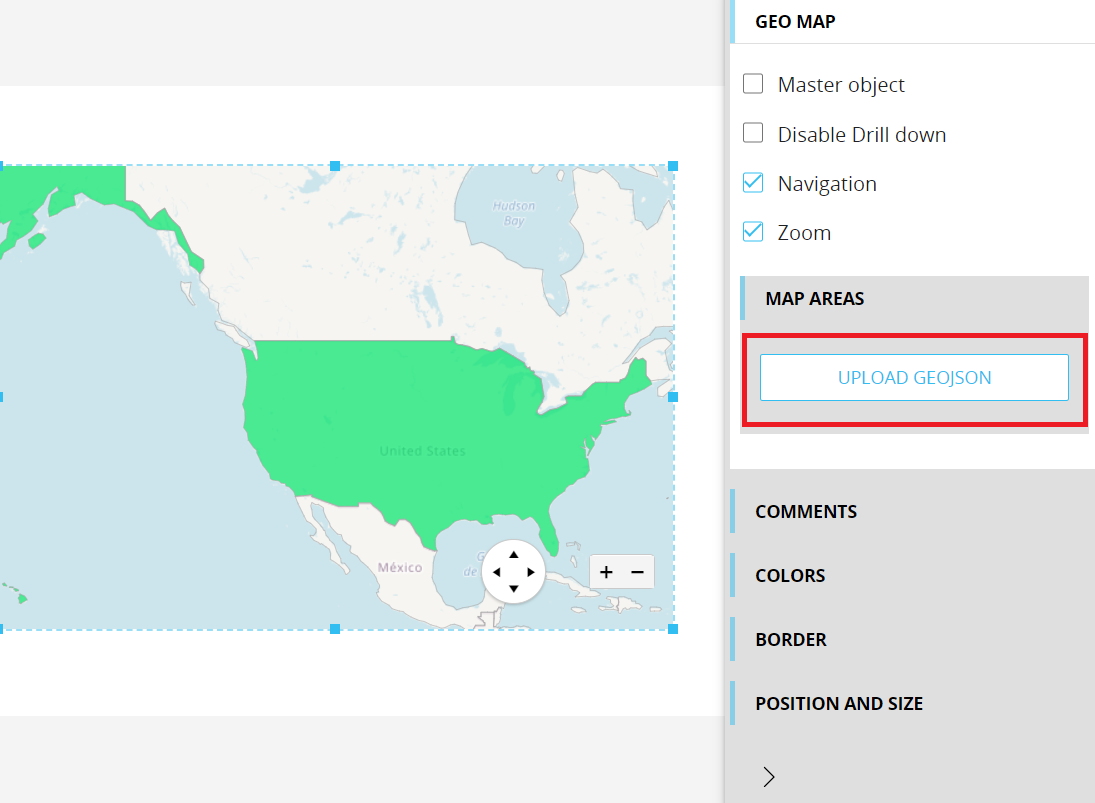
Once the user has clicked on the upload option the configuration wizard opens:
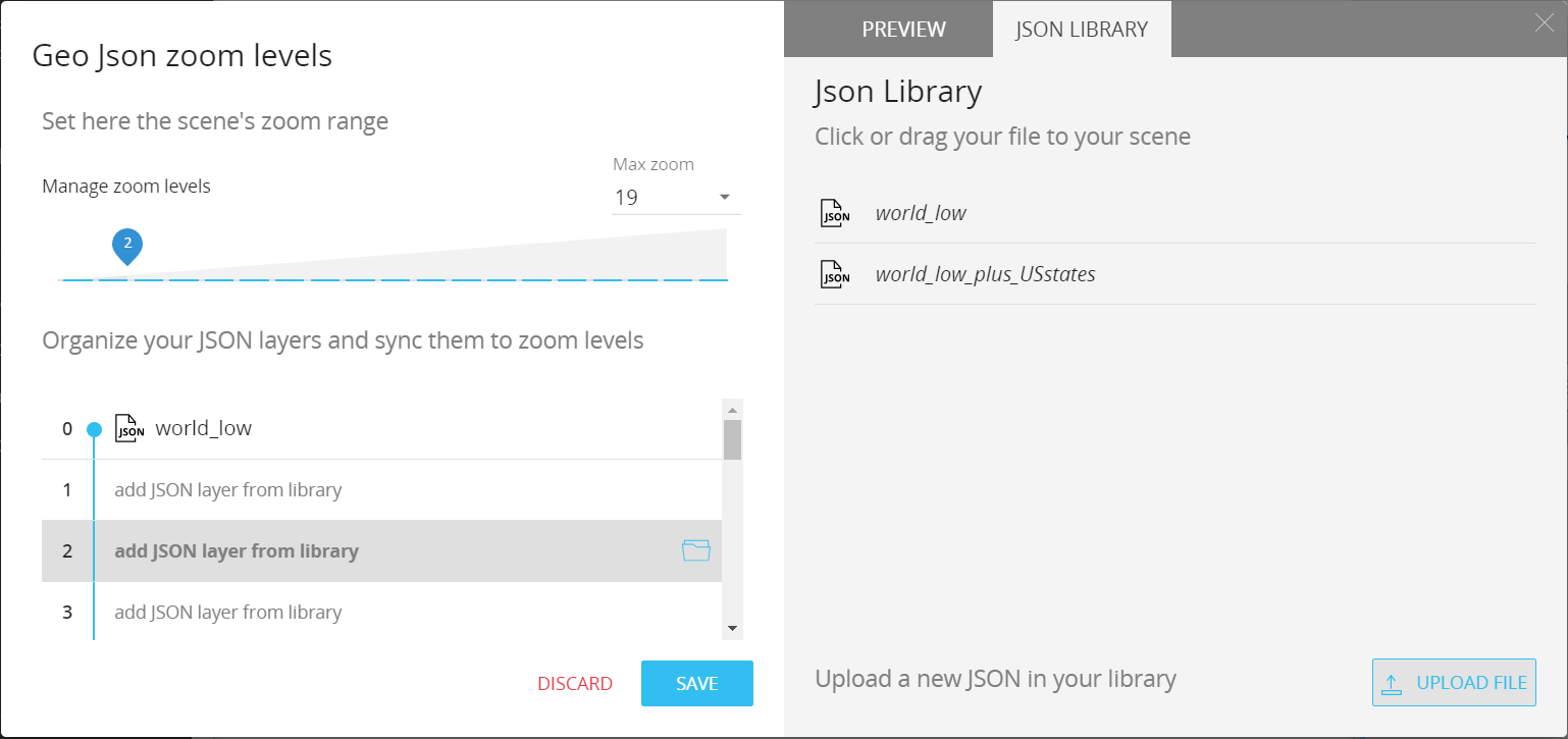
From there it is possible to upload the GeoJSON file to create the JSON library available for the map configuration.
On the left side of the wizard it is possible to configure the behavior of the map using the JSON files. In particular it is possible to configure the maximum zoom levels from 0 to 19. It is then possible to organize the JSON layers that corresponds to some of the zoom levels.
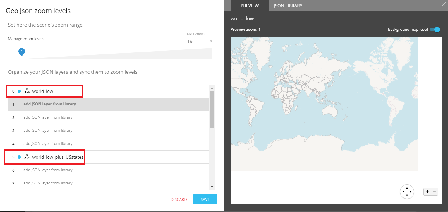
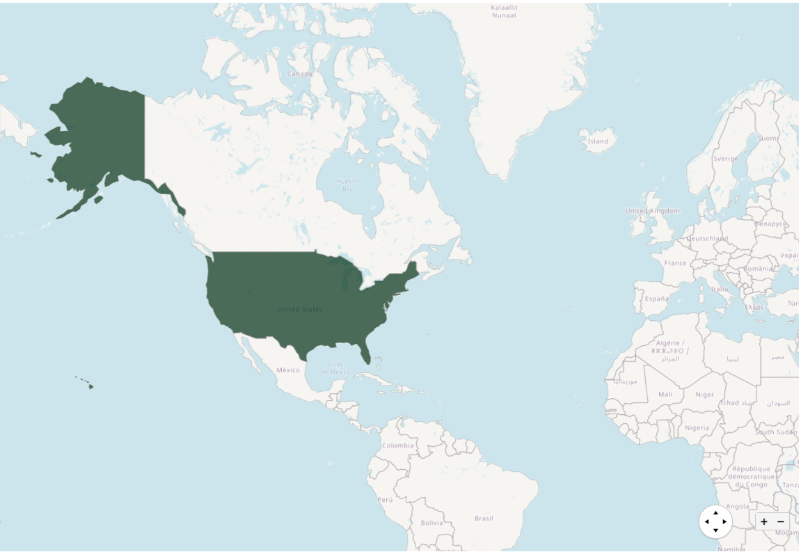
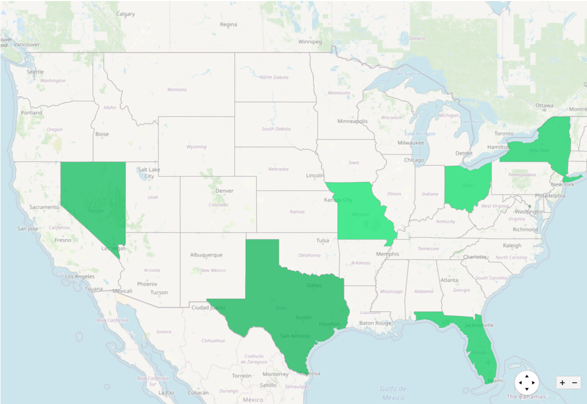
In the above example a JSON map has been set up for the first zoom level (0) and another JSON map on the fifth zoom level. Then, when a user is zooming on the map, it shows a JSON map layer according to this configuration.
This results in what you see below: zoom level 0 on the first image and zoom level 5 on the second image.
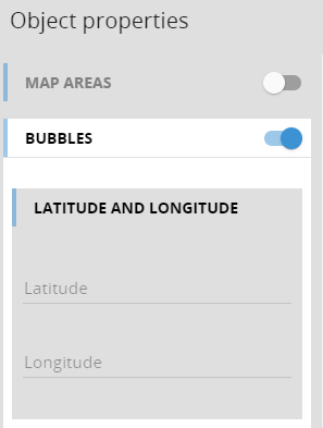
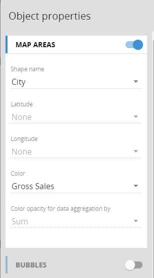
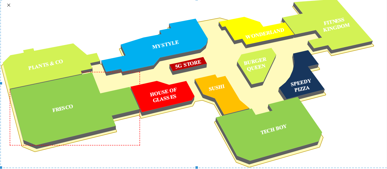
The Layout configuration supports now both, showing Bubbles are Map Areas.
For Bubbles the configuration is the same as it was in previous versions (Latitude and Longitude Blocks)
For Map Areas the configuration can be done by Latitude and Longitude Blocks OR using mapping the by Row Entity / Text Block to the ID of the SVG areas in the map. Both options support blocks to fill the color and opacity.
It is now possible to upload a SVG file on the SVG Map object. The Upload option is available on the SVG Map settings once in edit mode on a screen.
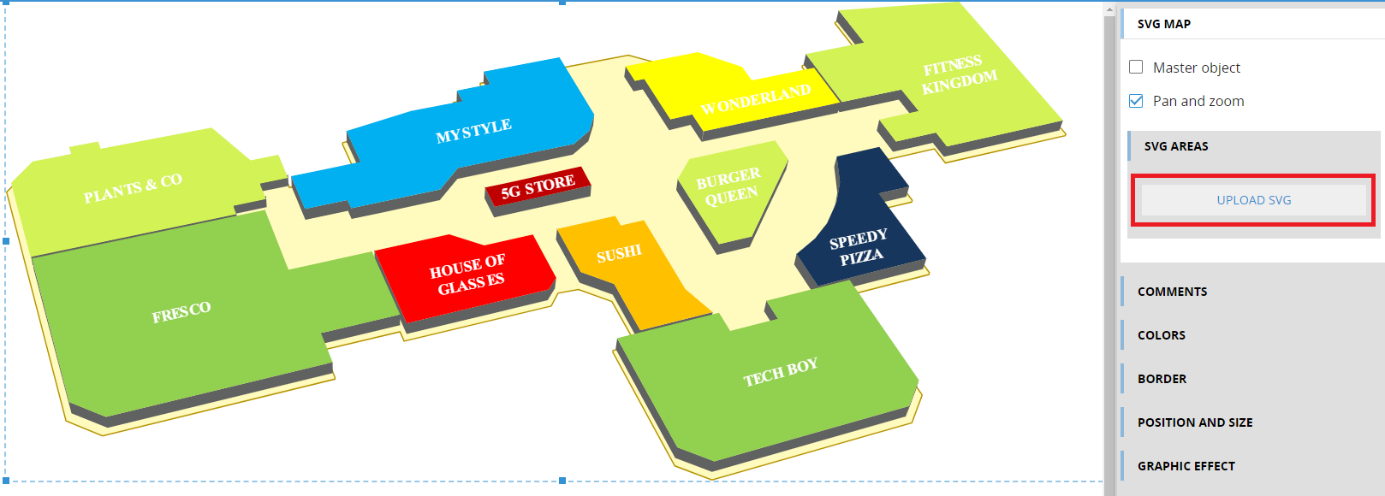
Once the upload option is clicked, the configuration wizard is activated:
From there it is possible to upload the SVG file to create the SVG library available for the map configuration.
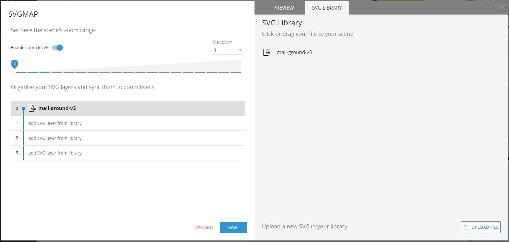
On the left side of the wizard it's where it is possible to configure the behavior of the SVG map using the SVG files. In particular it is possible to configure the maximum zoom levels from 0 to 19. Then it is possible to organize the SVG layers that corresponds to some of the zoom levels.
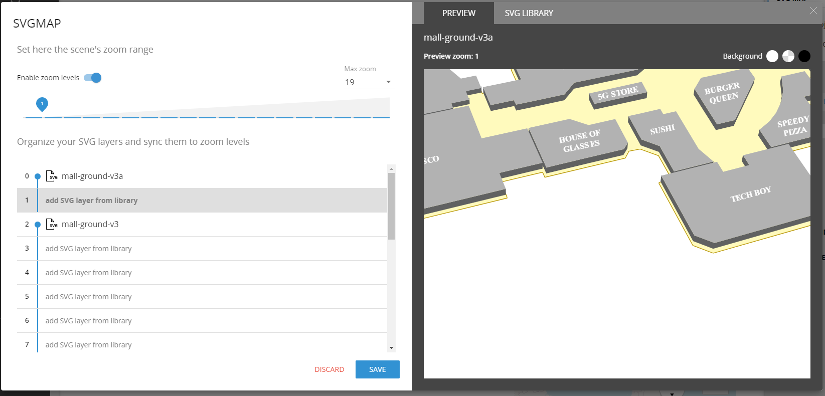
In the above example a SVG map has been set up for the first zoom level (0) and another JSON map on the second zoom level. When a user zooms on the map, a JSON map layer according to this configuration.
The Layout settings is used for the configuration of the SVG Map
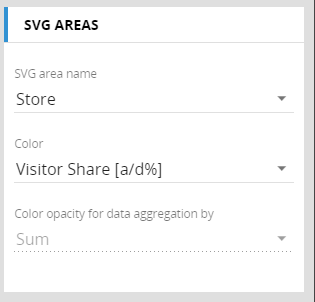
It is possible to either map the by Row entity to the ID Field of the SVG Objects or this mapping can be retrieved by a text block. Drill and Master are only available when using the by Row Entity.
Additionally, hovering a users cursor over the object will display a tooltip using the visible blocks from the Layout.
Impact analysis is new tool that allows to view the relationships between all objects and structures that constitute a Board application. This tool is very powerful for identifying the potential impact a change to the application may have or in understanding what should be done before making such a change.
This feature is available under the Data Model section on the Impact Analysis tile.
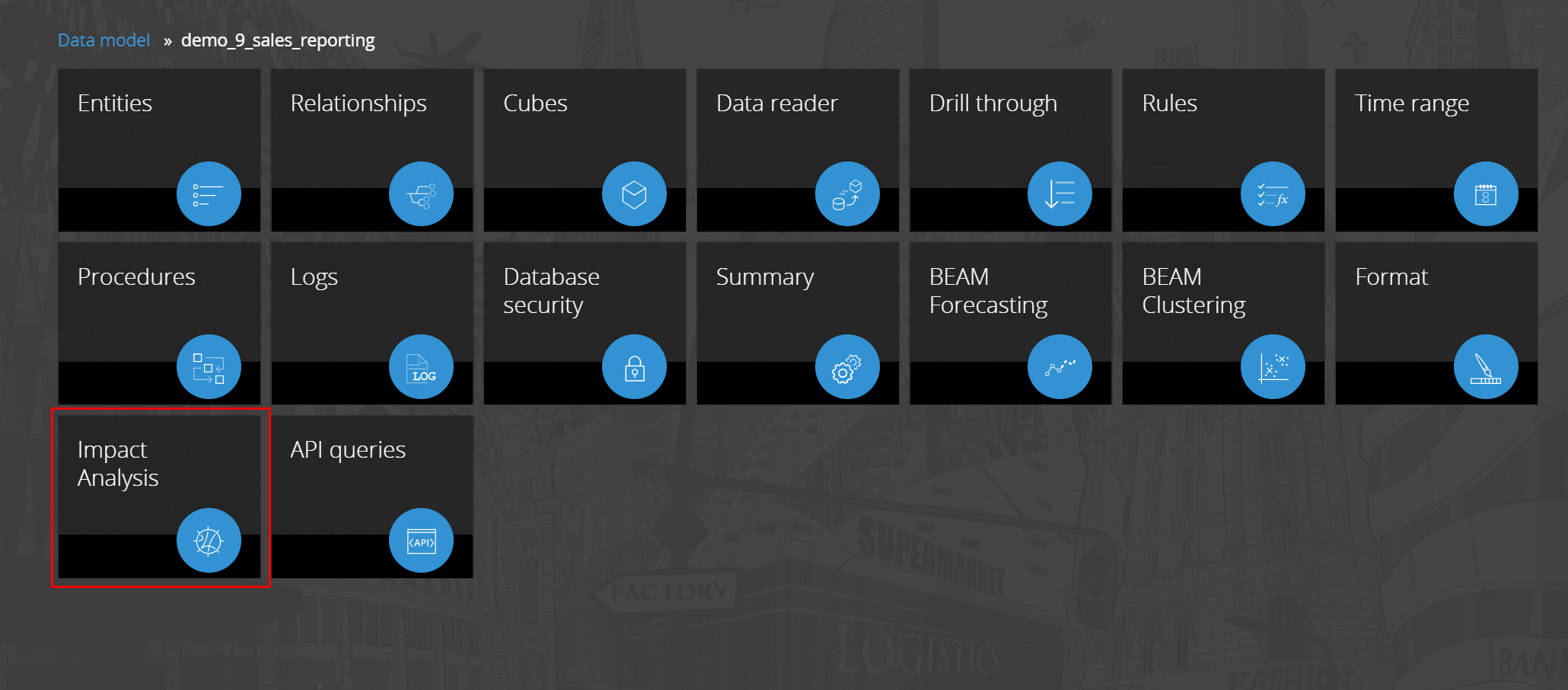
Clicking on the impact tile, the wizard will be taken to the configuration area of the tool.
A list of all objects that can be assessed is displayed. (cubes, entities, procedures, data readers, rule, entity format, capsule)
In the WHAT column the user must indicate which elements they would like to analyze. In the LINKED TO column the user must select which relations they would like to view.
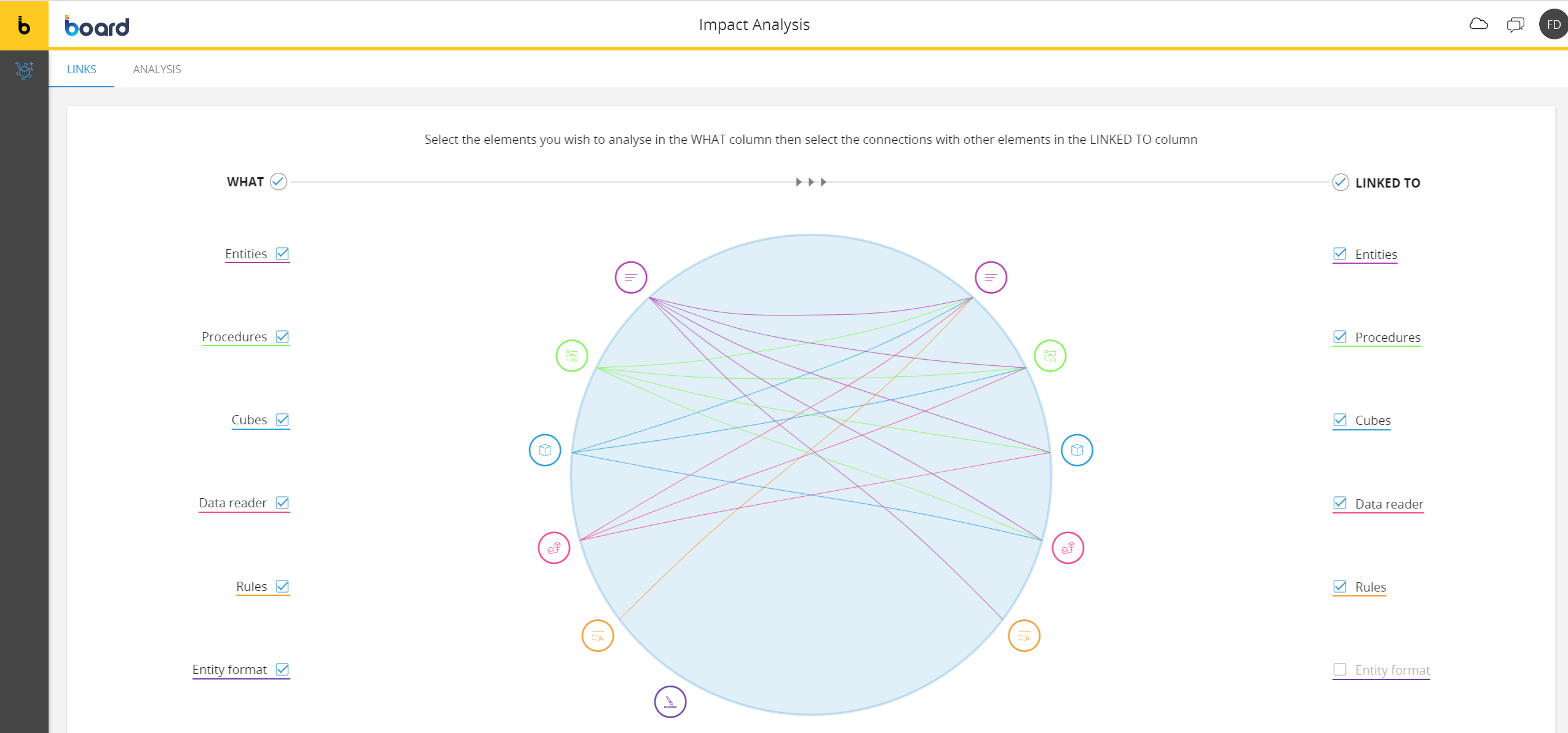
Clicking on analysis, the system will show all relations through a dynamic circular network chart.
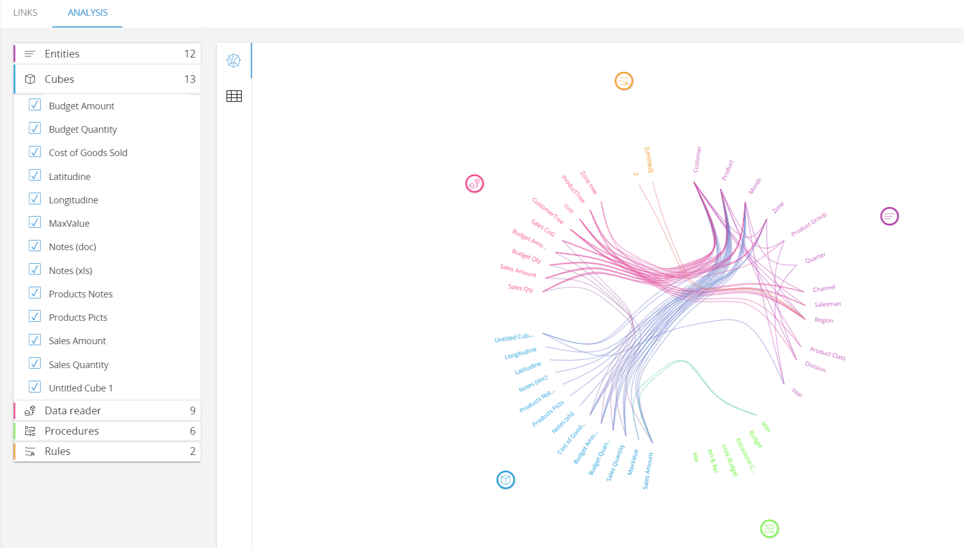
Through the left menu it is possible to filter each object, indicating the elements to be displayed.
A new full text search function has been implemented. The function is available in the search bar of the capsule browser or simply pressing CTRL + SHIFT + F.
This search function returns the results looking into the capsules and presentations available on that environment. It is possible to limit the search to a specific set of capsules available on the environment
The search is indexed on the back end and the indexing it is not executed at any user search action. The indexing runs following the search engine settings. The settings can be configured on the system administration section.
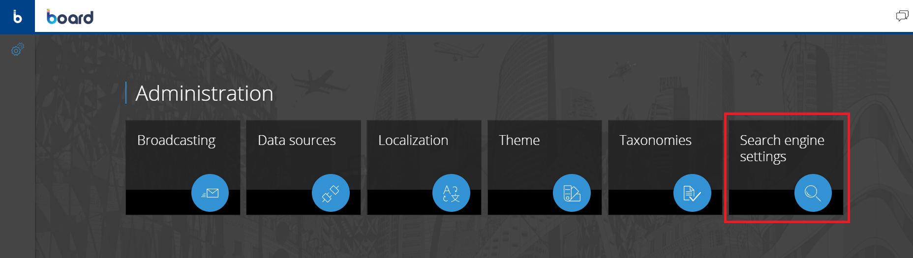
The available configuration parameters can be accessed through the Search Engine Settings tile as per the following screen shot:
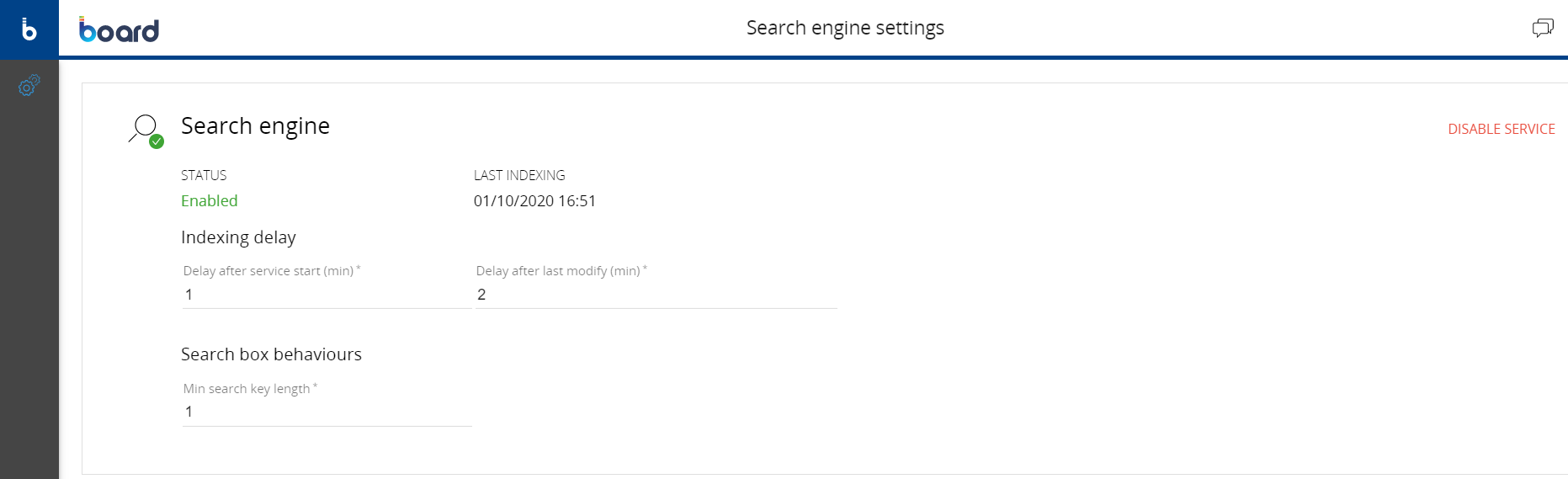
Indexing delay: It is possible to set up a delay before to run the search engine after the start of the Board engine. It is also possible to configure a delay that is applied to the search engine after any capsule modification.
Search box behavior: this setting affects the behavior of the search box. It defines how many characters needs to be typed in the box to trigger the search.
The search Engine can be disabled. It is suggested to keep it disabled during the development phase to avoid to many search engine runs. It is also possible to decide which capsule are included in the search and which one are excluded.
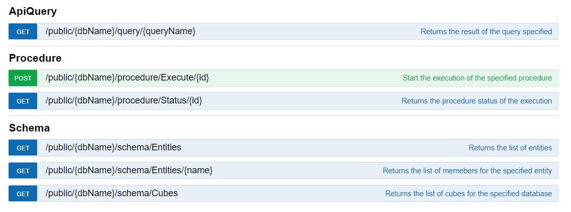
A new set of BOARD API calls has been implemented. There are 3 sets of API calls available:
ApiQuery
Procedure
Schema
The detailed list of the API calls is shown below:
The API call is divided into 2 steps:
Authentication
API call execution
In order to enable the use of an API call, it is mandatory to create an API Client. An API client is a Board User dedicated to the API calls.
It is possible to create an API Client user from the Users section on the system administrator tab.
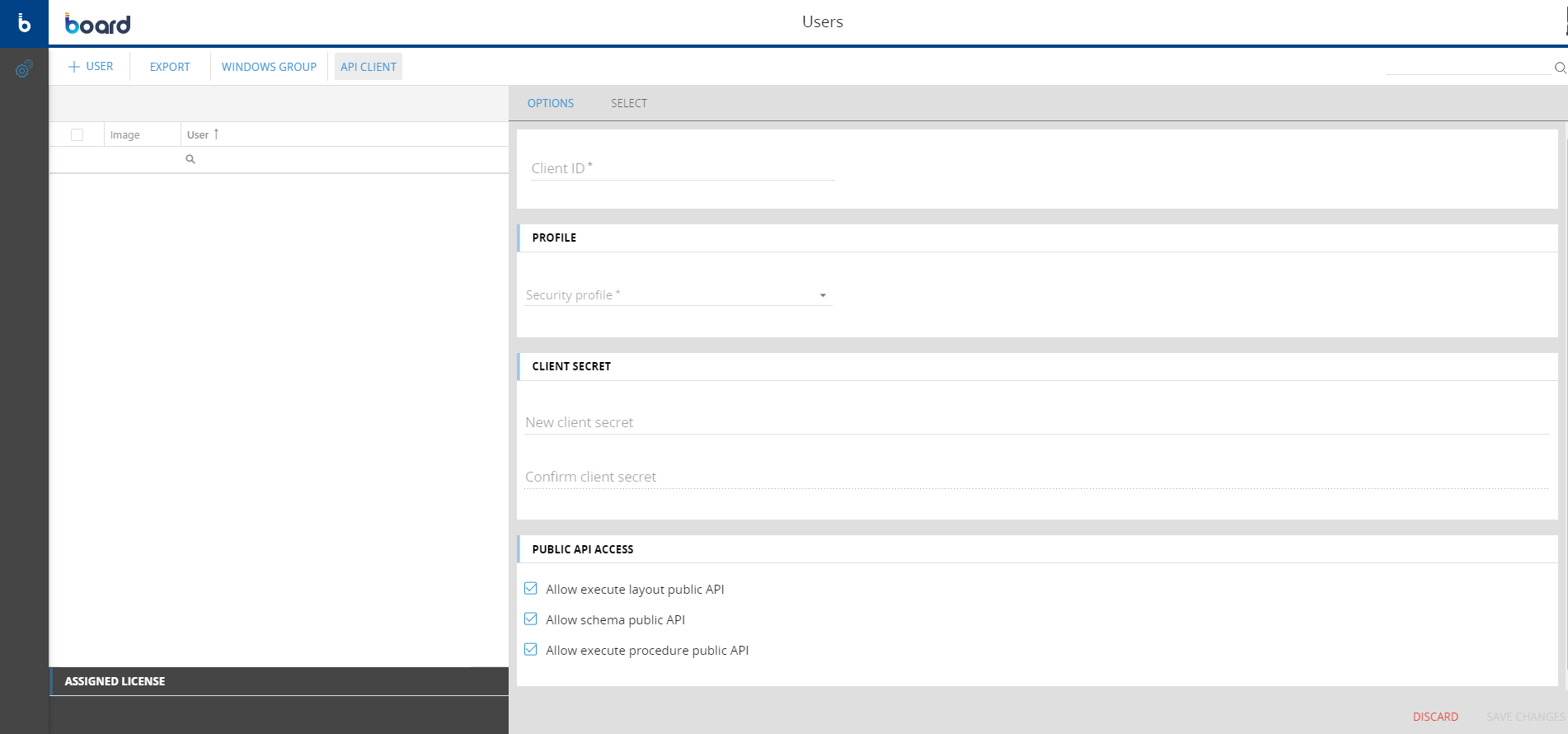
The API client requires the following parameters to be defined:
Client ID: username used to call the APIs
Client Secret: the password set for the Client ID
Profile: a BOARD security profile assigned the the Client ID
Public API Access: the list of API types available for that Client ID
The authentication then follows the OAuth2 standard. Then an authorization token must be generated.
The token returned from this request is the one that must be used to manage the authentication in the API requests. To get the token you need to set the following additional parameters
Grant Type: "Client Credentials"
Access Token URL: https://your_board_instance/identity/connect/token
Scope: "public-api"
Client Authentication: "Send client credentials in body"
Important Notice
The BOARD APIs are available for both BOARD Cloud and On-Premise customers. Any API user created is consuming a BOARD license (according to the assigned security profile). There is a limit on the number of call available on a BOARD instance: there are maximum 500 calls per day an 10 calls per second available.
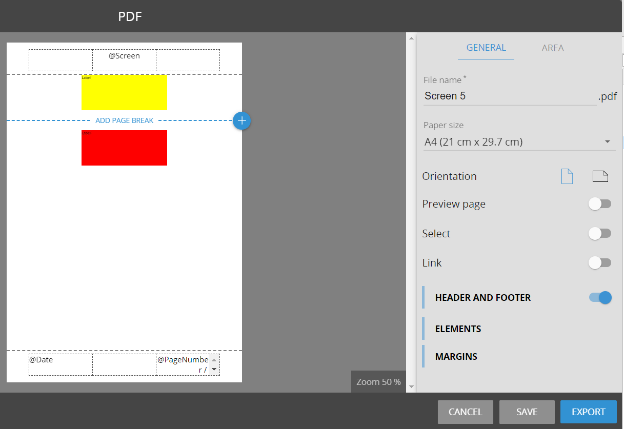
Some enhancements have been introduced on the reporting functionality. While accessing the print screen options it is possible to:
Include a Link to the capsule screen in the exported screen:
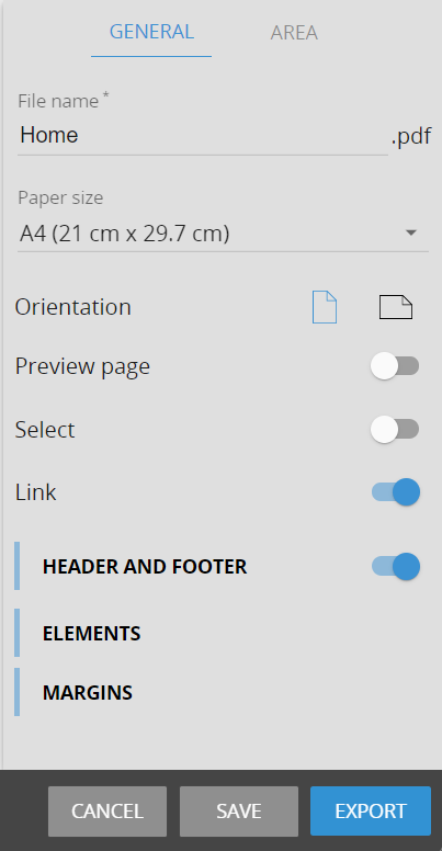
Add a page break between the objects defined in the printing areas. It is not possible to remove the page break after the dataview objects.
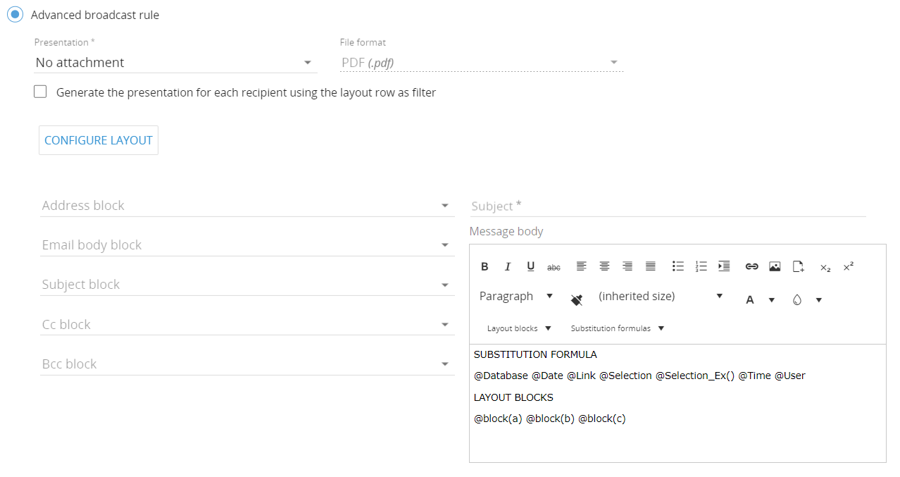
It is now possible to send out a broadcast without an attachment. This is available on the advanced broadcasting on the procedures and on the scheduled broadcasting actions.
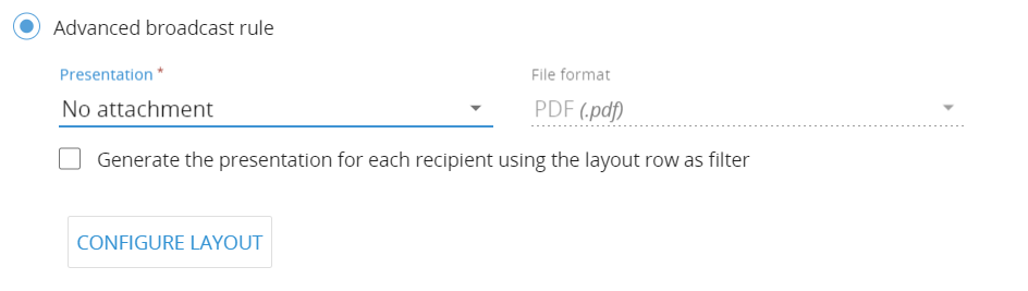
It is possible to include @functions in the broadcasting tasks. In the advanced broadcasting it is also possible to insert @functions that dynamically shows the value on a block defined in the layout configuration. Please see below:
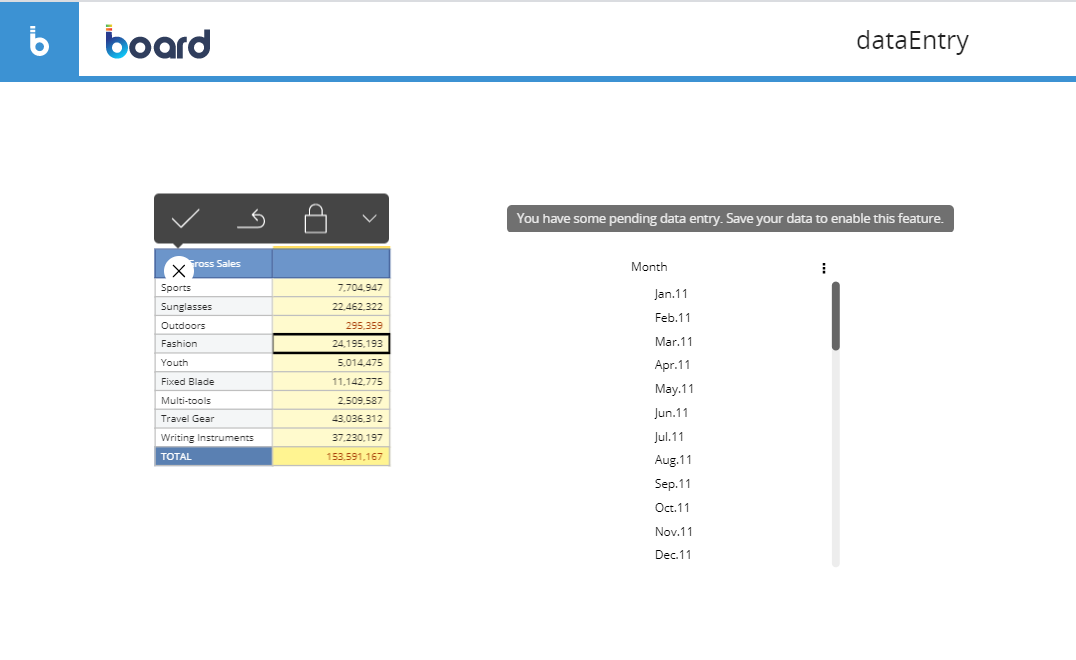
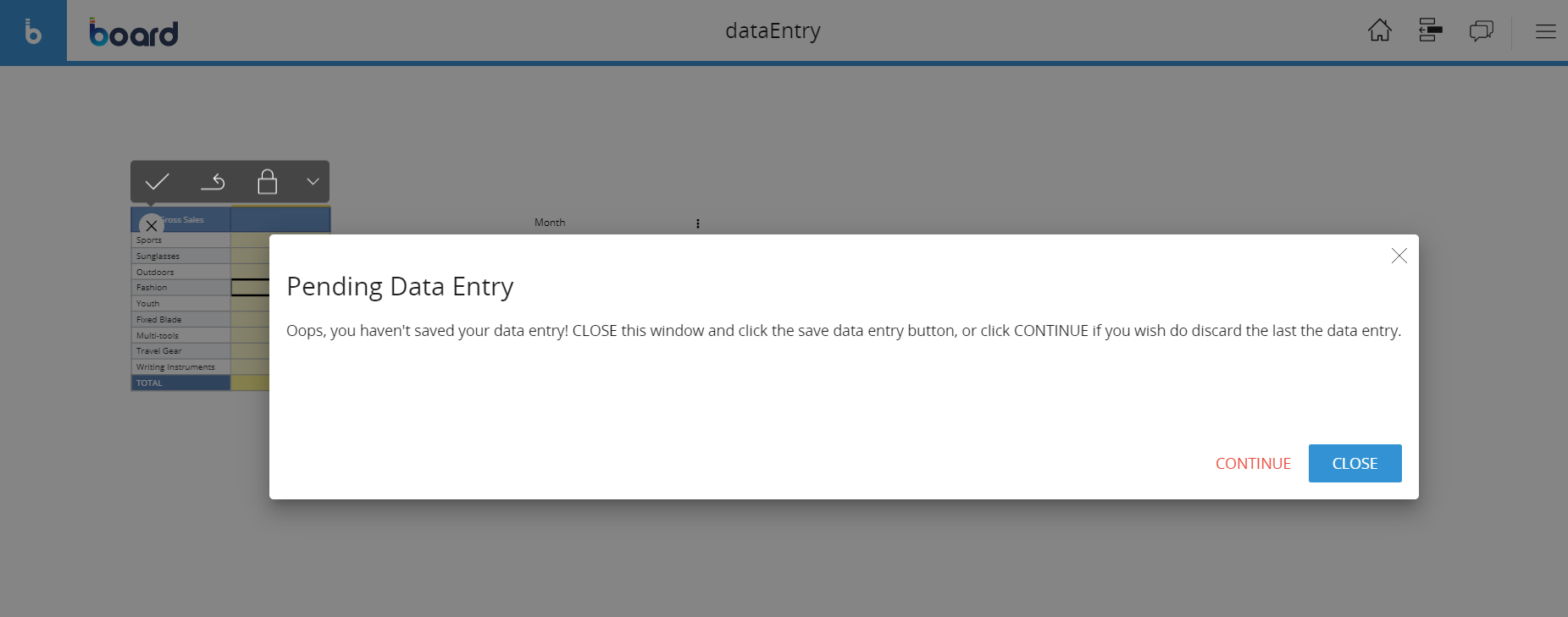
When a user is performing data entry on a view and there re some pending changes (not committed yet), the system is notifying the user if it's navigating in another screen or changing a selection.
Below 2 warning messages received when a user is trying to act on the selector object when a data entry is pending and when it tries to refresh the screen data:
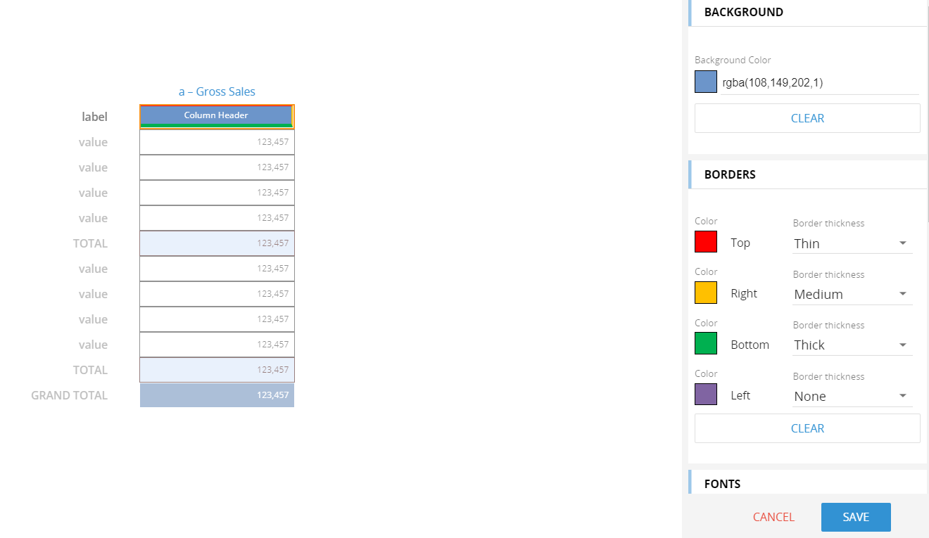
It is now possible to customise the borders size and color of the column headers through the block formatting options of the dataview:
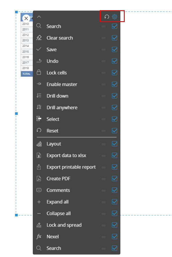
It is now possible to configure which options are available on the slinding toolbar. The configuration panel is accessible from the gear icon when in edit mode on the object.
The Quick Edit Layout functionality is available and can be used in the presentations
The Save As and Delete functions have been added on the Screen Masks when in edit mode on a Mask
Some enhancements have been introduced on the dialogs to make it more mobile friendly
Once a user logs into the web application the focus is active on the search bar on the top right corner
The slide list is available in the presentations (on the top right menu)
The graphical design of the drill down dialogs has been reviewed. The sizing of the dialog has been improved: it is automatically sized once opened depending on the size of the layout
Dataview: a malfunction of wrap text function in multi level column headers has been corrected
Dataview: on Alert by function, an identifier for Block has been added
Dataview: the sorting of items in combo boxes in layout properties
Dataview: a malfunction on dataview with a filter and AVG function has been fixed
Dataview: Improvements in column width management
Dataview: Drill to screen from vertical layout is now supported on web application
Dataview: it’s now possible configure a lock data entry cube in a drill down layout
Edit layout: some improvements on Validation Rules have been fixed
Edit Layout: improvements in the display of the configuration panel
Edit Layout: column sort with detail by is now supported
QuickLayout: Settings get Lost when Screen is added to Presentation
QuickLayout: An error on quick Edit Display has been fixed
Entity Editor: Drill-down is now supported if the screen contains this object
Entity Editor: procedure cannot be performed unless an item is selected
Chart: in the Waterfall graph it is now possible to rotate the Category axis labels
Chart: On the x axis it is now possible to display the label with a rotation of 45 degrees
Chart: A malfunction on color alert in Treemap has been fixed
Chart: Postfix character now appearing on chart labels
Chart: text cube are now visible in the tooltip on the web application
Chart: a malfunction in the display of alerts in the geomap has been fixed
Chart: Geomap with master layout is now supported
Chart: markers color on pie chat is now supported on web application
Screen: A performance issue on the Screen Selection window execution has been corrected
Screen with Rolap Cubes from different sources on the web application
Screen: Multiple issues on the MyView function have been fixed
Screen: Comment are now visible in Play Mode
Mask: A fix on the calendar object has been introduce on the web
Print: A malfunction on Print based on pager with @Selection has been fixed
Procedure: extract layout using the @user function in the path, now create the folder if it doesn't exist
Procedure: An error that was occurring on custom path changes after renaming cube/entity has been corrected ()
Export: Export printable report to PPT in "protected View" mode the PPT is now displayed correctly
Export: A malfunction on export of a screen with a mask has been fixed
Entity Formatting: now support SHIFT or multiple selection
Entity formatting are now kept in drill down
Relationships: missing child's were not displayed correctly
Datareader: A malfunction on the datareader with ETL formula has been fixed.
Analysis: Time dimension are now included
Office Add-in: authentication through a proxy web is now supported
Office add-in: SAML authentication to SSL server is now supported through the http/https protocol
Presentation: an Error when screen contains an empty Tab object has been fixed .
Presentation: lite and lite+ users can now create a new presentation
Broadcasting: a malfunction with excel file attachments has been resolved
Broadcasting: Summary now show the scheduled datetime
Transporter: custom time entities are now available during the transporter actions.
Transporter: Timestamp within Transporter Package now shows the correct value
An issue with the use of replicated entities in concurrency has been fixed
Concurrent use of datareaders has been improved form a performance point of view.
A new patch has been released. The patch includes fixes for the following topics:
a correction on the SAP readers called from a procedure
a fix on the data-entry triggers configured on the dataview object
a fix on text datareader with source files located in the shared storage folder of the BOARD Cloud instances
a correction on the native BOARD backup functionality
a graphical malfunction on the new tree object has been corrected
a display issue of the drill through pop-up window has been corrected
an exception generated by the flatten groups configuration on dataviews has been fixed
a malfunction on the flatten settings of the dataview object has been corrected
a fix on the refer-to function used in dataflows
an exception during the connect through the https protocol using the add-in has been fixed
deprecated prerequisites have been removed from the Office Add-in Installers
New 11.3.0.1 Patch available!
The new installers include fixes for the following topics:
a malfunction on the flatten settings of the dataview object has been corrected
a malfunction in the data-entry pattern based on configuration has been fixed
a review of the lock dataview function on totals and algorithms
optimizations of the execution of a set of specific dataflows and selections triggered during a procedure has been included
a malfunction on the migration of the SQLite collaboration database has been fixed
a set of fixes for the broadcasting-like features has been included
writeback in data-entry is now available for the Vertica ODBC native driver
a fix for the formatted text displayed on a dyna-write object has been included
a malfunction in searching the suggested values in dataviews has been fixed
a wrong display of the substitution formulas in a specific condition has been corrected
a fix for the data-entry log has been included
the generic "cannot find the path specified" error message on the admin portal has been replaced by the actual exception generated by the procedure launcher tool
Important Notice
Board 11.3 requires .NET
framework 4.8, Board installer will automatically install this version
of the framework.
.NET Framework 4.8 is mandatory for version 11.3 or higher