1 Introduction
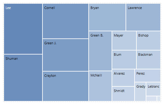
A tree map is a diagram that shows data as a set of nested rectangles of varying sizes. You could create a tree map of salesmen to compare their sales. A salesman with a large sales would display as a large rectangle. The tree map is scaled to best fit the available space, so the sizes of the rectangles should be considered in relation to each other, rather than as an absolute number.
It can be really useful in reports related to rankings, classification, items evaluations and adopted in all corporate departments either in those less values/numbers-related.
2 How to create and use a Tree-map Object
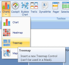
Click on charts icon and drag & drop into your screen the Treemap Object
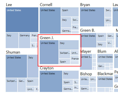
Right click on the object to open layout and insert Data you need
Setup the Axis accordingly to the Heat-map granularity (Rectangles) you like.
When two or more entities are set by row (Salesman and Country in the sample above) the Rectangle Sizing is iterated on the two nested dimensions.
NOTE
You can use unlimited Entities by Row.
No entity are admitted by column
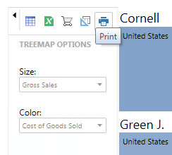
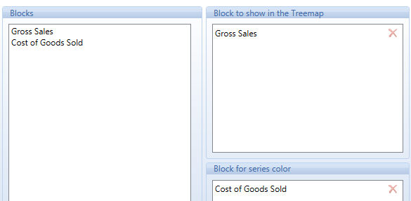
The Tree-Map is based on two main measures : size and color intensity . Click on the option tab and drag and drop the Layout blocks.
|
The sliding tool bar gives the possibility to change your data series and color coding on the fly or to prompt the Data View Spreadsheet. The color coding can be changed using the Alert Property of the block chosen for the series color. |