The Impact Analysis section
This topic describes the Impact Analysis section of the Data model and the information it provides.
In this section, you can analyze the connections between all of the elements that are part of the Data model structure. This is very useful for analyzing the impact that a change to the Data model structure may have on all Board applications based on that Data model.
In addition, this feature can be used to have an overview of the resources in the Data model structure and spot any missing or wrong connections between them.
To access the Impact Analysis section, access the designer space of the desired Data model and click on the Impact Analysis tile. You will be taken to the Impact Analysis homepage, which is divided into the "LINKS" and "ANALYSIS" pages.
The Impact Analysis feature uses the Search engine service to perform the indexing of all elements in a Platform. Therefore the Search engine service must be enabled for the Impact Analysis features to work.
Links
This page is displayed by default when you access the Impact Analysis area or when you click on the "LINKS" tab in the upper left corner. It displays a chord diagram of all the Data model elements and their connections to each other, which can be analyzed in detail in the ANALYSIS section explained in the next paragraph.
The elements whose connections can be analyzed are the following:
- Entities
- Cubes
- Data readers
- Procedures
- Capsule Procedures
- Rules
- Entity formats
- Drill throughs
- Capsules
Click the table icon or the circular icon in the upper left corner of the screen to switch between the chord diagram and a table-view of the connections between the Data model elements.
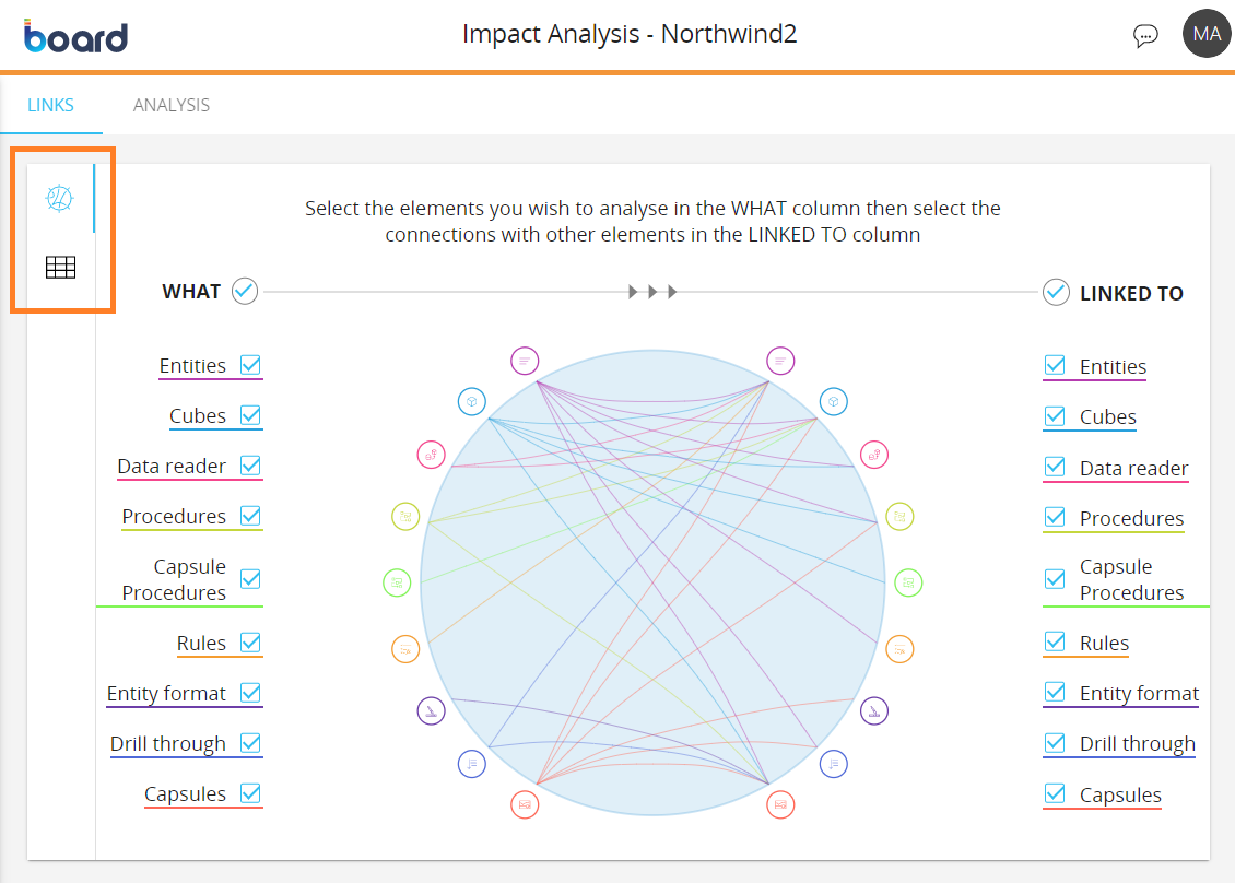
Chord diagram
In this area, the Data model elements are displayed both on the left and on the right of the diagram, under the “WHAT” column and the “LINKED TO” column respectively. These elements are arranged radially along the circle, with the connection between them drawn as arcs connecting them inside the circle area. Each element is underlined by a specific colored line, which is reflected in the icon color and in the line that connects the selected elements.
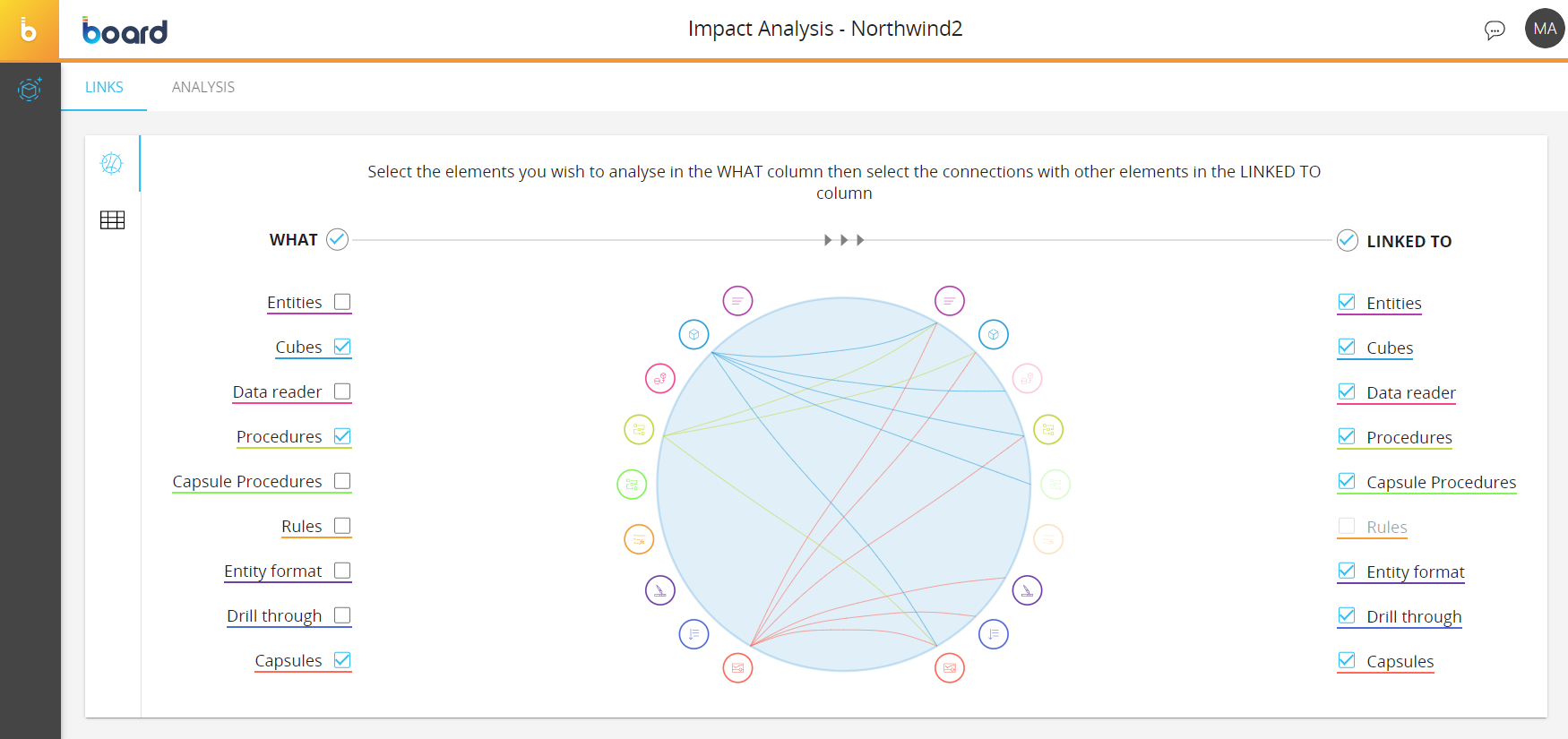
When you open the Impact Analysis page, all Data model elements are selected in both columns by default.
To choose the connections that you want to analyze in the chord diagram, proceed as follows:
- Select or deselect the desired elements under the “WHAT” column. To select an element, you can click the corresponding icon on the left side of the circle, which will be highlighted after you click on them. You can also click on the checkbox next to “WHAT” to select or deselect all elements.
- Select or deselect the desired elements under the "LINKED TO" column. You can also click on the checkbox next to “LINKED TO” to select or deselect all elements. Elements that don’t have a connection with the element selected in the step above are disabled
- Choose which connection you want to highlight by clicking on the icons on the left side of the circle. You can only highlight the connections of one element at a time. Click outside of the icons to disable the highlighting of connections.
Table-view
Click the table icon to switch to the table-view interface, where Data model elements are displayed under the “WHAT” column on the left and the elements they are connected to are displayed under the “LINKED TO” column on the right.
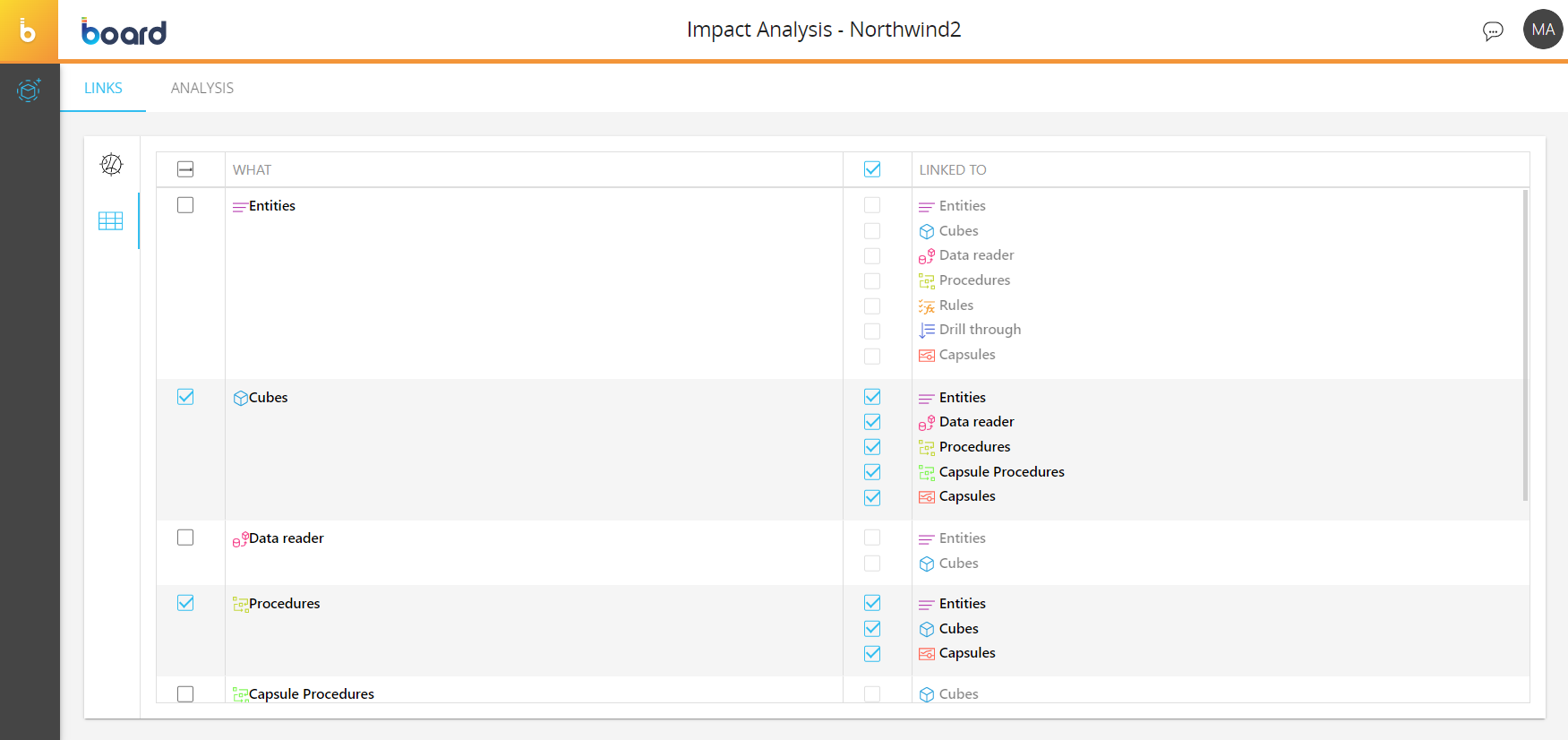
When you switch to the table-view interface, the selections made in the chord diagram will be applied to the table as well.
To choose the connections that you want to analyze in the table-view interface, proceed as follows:
- Select or deselect the desired elements under the “WHAT” column. You can click on the "Select all" checkbox on top to select or deselect all elements
- All elements connected to the selected elements in the step above are automatically selected under the “LINKED TO” column. You can select or deselect each element individually or click on the "Select all" checkbox to select or deselect all elements
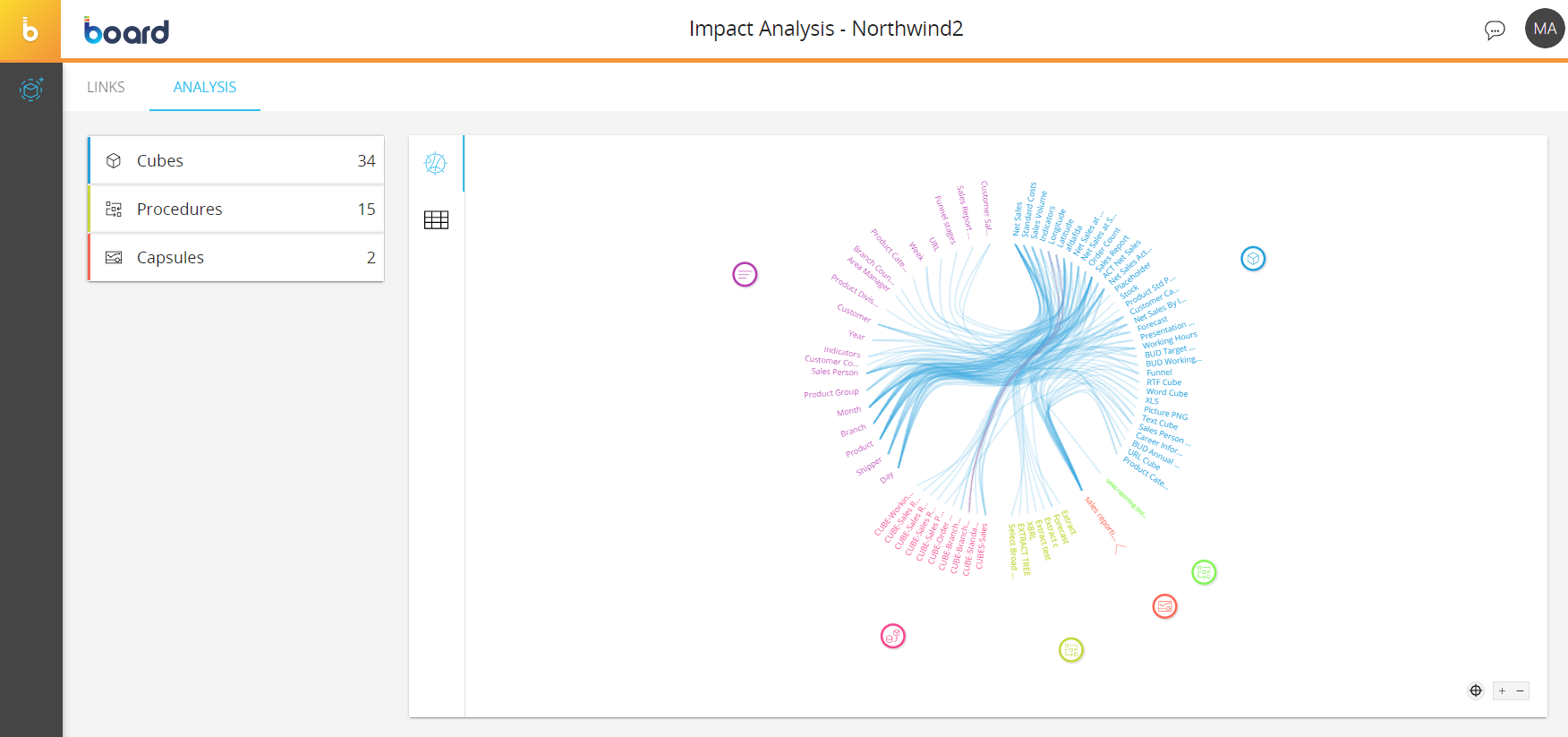
Analysis
Once you have selected the desired elements in the Links page, you can analyze their connections in more detail in the Analysis page. Click on the “ANALYSIS” tab on the upper left corner of the screen to access this page.
As with the Links page, you can visualize the information in two different representations. Click the table icon or the circular icon in the vertical menu in the middle of the screen to switch between the chord diagram and a table-view of the connections between the items under the selected Data model elements.
Chord diagram
The chord diagram on the right displays the names of the items radially along a circular shape (i.e. if the selected elements are “Cubes” and “Entities”, the names of the Cubes and Entity members are displayed along the circle) with the connection between them drawn as arcs connecting them inside the circle area. The lines have the same color as the selected items.
You can zoom in on or out of the chord diagram with your mouse wheel or by clicking the + and – buttons in the lower right corner.
You can pan around the chord diagram chart by holding down the left button of your mouse and moving your mouse.
To analyze one or more connections in the chord diagram, you have various options:
- Option 1. Hover or click on an item around the circle to highlight its connections. Click on a Data model element icon to highlight all related items and their connections
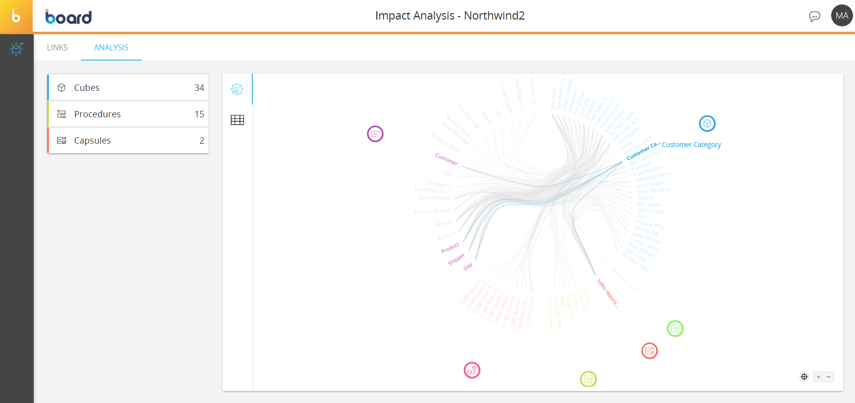
- Option 2. Click on an element in the menu on the left to reveal its items and then select them to filter the chord diagram accordingly. This option allows you to isolate your desired connections which will be easier to read when, for example, the Data model includes a large number of elements and connections. The menu displays the names of the Data model elements, their icons, and the total number of their items. In the case of hierarchical elements (i.e. Entities) the menu also reflects their relationships.
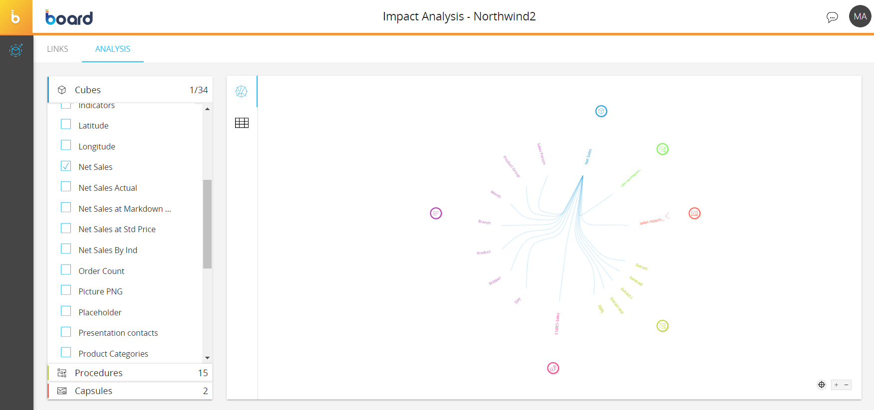
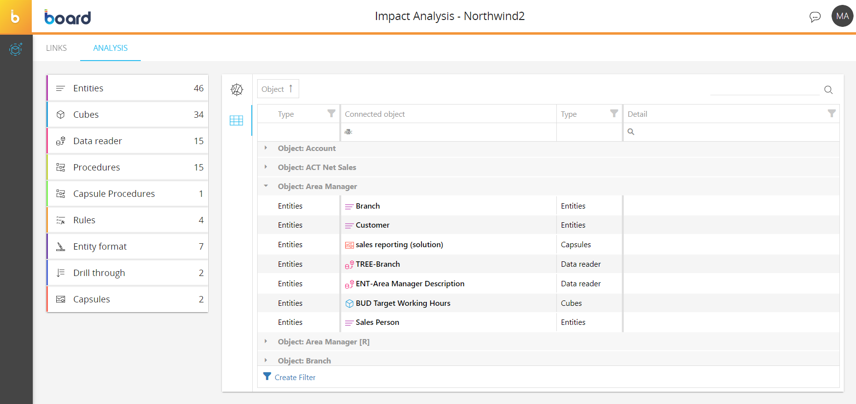
Table-view
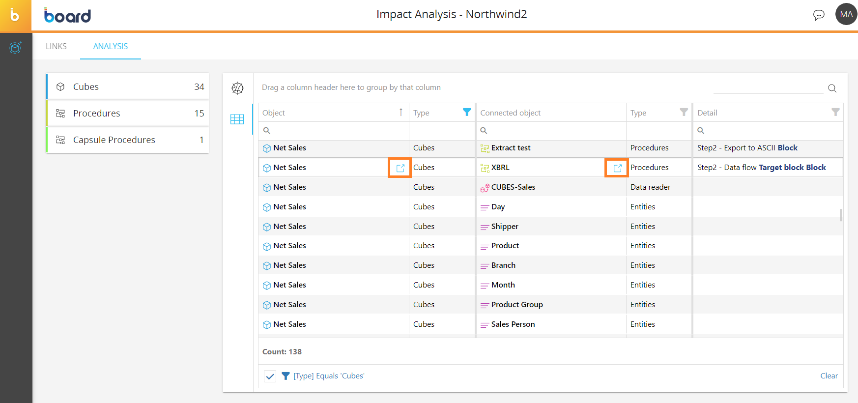
On this page you can analyze the connections between all of the elements of the Data model in table form.
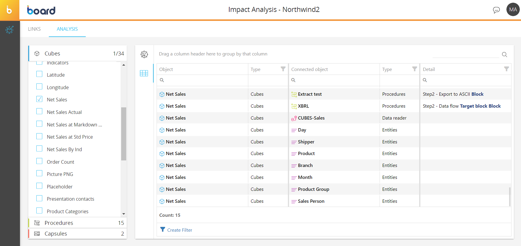
The table is sortable and searchable using the interactive header fields. You also can filter the table in the same way as the chord diagram by selecting or deselecting elements in the left menu.
The table is divided into the following columns:
- Object. This column displays the items whose connections you want to analyze. The name of each item is replicated for each relationship to other items (for example, you may find the name of the same Cube repeated in as many rows as the number of its dimensions, and Procedures or Capsules where it is used)
- Type. This column displays the type of item listed in the "Object" column (i.e. Cube, Entity, Procedure etc.)
- Connected object. This column displays the name of the item connected to the item in the “Object” column
- Type. This column displays the type of item listed in the "Connected object" column (i.e. Cube, Entity, Procedure etc.)
- Detail. This column displays additional details about the connection between two items. For example, In the case where a Cube is used in a Procedure, the exact number and name of the step in which the Cube is used will be displayed in this column.
You can drag and drop a column header in the field above the table to group the elements by that column header. For example, if you group the data by Object, the table will display collapsible rows whose title is composed of the column header and the name of the items it contains. Click on the downfacing arrow to expand the rows and view the connected elements. You can also group by multiple columns and drag and drop the columns to the header row to ungroup the items.
In addition, you can click on the "Create Filter" button in the bottom left corner of the table to open the Filter Builder. This allows you to add logical operators and conditions to filter the table in a more specific way. This is useful, for example, when there is a high number of items and connections to analyze.
To build your custom filter, proceed as follows:
- Click on "Create Filter" to open the Filter Builder
- Click on the red "And" button to choose a logical operator
- Click on the "+" icon to add a condition. You can also add another group of conditions with its own logical operator
- Specify the condition by following these steps:
- Click on the blue "Object" button to select the column that will be filtered
- Click on the green "Contains" button to select a conditional operator. Board uses this operator to compare the values in the chosen column with the values entered in the next step
- Enter or choose the value to define the circumstances in which the condition is deemed to be true in the gray field.
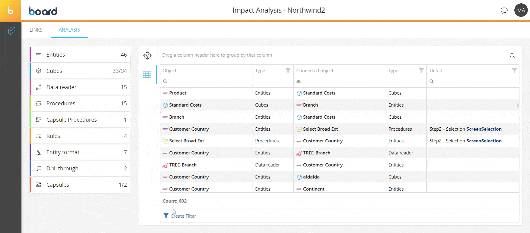
The table also provides direct access to each item detail page. Click on the icon that appears next to the item name when you hover over one of them to directly access that element. For example, in the case of a Procedure, you will be taken to the Procedure detail panel where you can view or modify that Procedure (if the Procedure is a Data model Procedure and not a Capsule Procedure).